How TurboTax Used Design and Emotion to Solve a Boring Problem and Dominate an $11B Industry
Millions of people electronically file their taxes online every year. In 2017 alone, more than 52M people filed self-prepared tax returns electronically. From basic individual returns to complex organizational tax situations, e-filing has made it so much easier to file your taxes. But it wasn’t always like this. Not so long ago, most people were skeptical of filing taxes online. What about security? What if you made a mistake? What happened to your return once you submitted it?
One company saw another way and created a product that would transform how we think about, file, and pay our taxes. That company was Intuit, and that product was TurboTax.
At first glance, the minutiae of tax preparation software might not seem particularly exciting. However, TurboTax grew amazingly fast precisely because tax preparation was seen as such a “boring” problem to solve. Nobody else even thought to tackle a problem like the inefficiencies of filing paper tax returns. Intuit used this to its advantage and focused relentlessly on making its users’ lives easier by taking the pain out of filing tax returns—and they won big.
Let’s look at:
- How TurboTax evolved first by solving a boring problem more effectively than anyone else
- Why TurboTax’s focus on the experience of filing taxes electronically was so fundamental to the company’s growth, and how it used emotional triggers to intentionally design and create a better tax experience
- What TurboTax’s customer-centric approach to product development in a “boring” market can teach companies in other verticals
TurboTax has become extraordinarily popular in recent years. Although the story of the TurboTax we know today began in 1999, to really understand the rise and rise of TurboTax, we need to travel back more than 30 years to Ronald Reagan’s America of 1983.
1983-2007: Filing Like It’s 1999, E-File Goes Mainstream
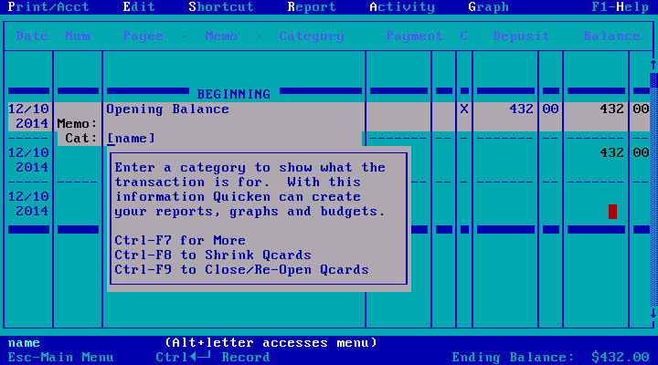
When Intuit launched its personal finance management tool Quicken in 1983, there were already dozens of similar financial products available for the nascent home computer market. Many of these products boasted features and functionality that Quicken lacked. What set Quicken apart from its legions of competitors, however, was that it was the first consumer finance tool to focus heavily on design and user experience.
Rather than presenting users with dense, intimidating database-style views, Quicken was designed to look and feel familiar to users by incorporating design elements seen on checks and checkbook registers. This was more than an attempt to differentiate yet another product in a crowded market. It was the first of many signs that Intuit was, at its heart, a design-focused company.
Design was a major focus for Intuit’s product teams, but it wasn’t the only focus. Shortly after launching Quicken, Intuit’s co-founder Scott Cook implemented the company’s Follow Me Home program. To learn how people were really using Quicken, Intuit dispatched employees to shopping centers and strip malls all over America. These employees would approach people purchasing Quicken and ask if they could follow them home and watch them install the software. It was a surprisingly effective way for Intuit to learn about and document problems that real Quicken users were experiencing, both during installation of the software and during regular use. Intuit also relied on data gathered by its “usability labs,” on-site testing environments in which participants used Quicken under observation.
Shortly after the launch of the Follow Me Home program, Intuit realized that while some people were using Quicken as intended—to balance their checkbooks—many were also using Quicken as a bookkeeping tool for their small businesses. It was this insight that led to the development of another immensely popular Intuit product, QuickBooks. Intuit may have been shoring up its products against future competition by focusing extensively on real-world use cases, but the usability labs and Follow Me Home programs were more than that. They were a reflection of Intuit’s approach to software development. Quicken wasn’t just popular because it was easy to use—it was popular because Intuit listened carefully to what its users wanted and how they were actually using Intuit’s products.
The Follow Me Home program is a great example of what Intuit refers to internally as “customer-driven innovation.” As any product manager could tell you, observing real users actually interacting with your product can be immensely beneficial. In Intuit’s case, it allowed the company to observe customers experiencing real problems in real time—problems that even savvy taxpayers might otherwise struggle to articulate. Observing taxpayers using TurboTax at home often revealed specific problems that may have otherwise been overlooked, such as struggling to complete an insurance claim for hospital expenses. This allowed Intuit to really drill down into the specific problems taxpayers encountered frequently and became a defining characteristic of Intuit’s strongly research-driven approach to product development.
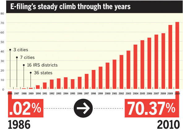
Although it would be many years before filing taxes electronically became mainstream, technological advances in tax preparation had been in the works since shortly after Quicken’s launch in the early 1980s. The IRS’ Electronic Filing System (EFS) was actually first devised in 1986 and served as an experiment to gauge public opinion about alternatives to filing paper returns. Only five tax preparation specialists in three metropolitan areas—Cincinnati, Ohio; Raleigh-Durham, North Carolina; and Phoenix, Arizona—agreed to participate in the program. Even then, only returns from taxpayers that were owed refunds could be processed electronically.
The technology behind the EFS pilot was archaic by today’s standards, but it was truly remarkable back in 1986. After examining a taxpayer’s return, which had been sent to one of the participating preparers by fax, the tax professional would call the IRS’ service center in Cincinnati. An IRS employee at this service center then connected their telephone to a machine known as a Mitron, a machine that Leonard Holt, a former branch manager of the e-filing project office, described as a modem with a tape drive. Once transmission of the data was complete, the Mitron’s tape was transferred to a mini super-computer known as a Zilog. This computer then processed and fed the data into the IRS’ Unisys computer system, which had been built using the now largely defunct COBOL programming language.
Despite the potential of the EFS pilot, tax preparers and the general public were highly skeptical. Many people believed the new system was not intended to make taxpayers’ lives easier, and that it was actually designed to surreptitiously collect additional information for auditing purposes. The public’s suspicions notwithstanding, 66 tax preparation professionals participated in the EFS program the following year in 1987, filing approximately 78,000 returns electronically.
By 1988, the IRS had transitioned to a new processing system using the IBM Series 1 16-bit minicomputer. This eliminated the need for an IRS employee to connect their telephone to the Mitron—along with much of the apprehension tax preparers felt about using the system. E-filing was here to stay.
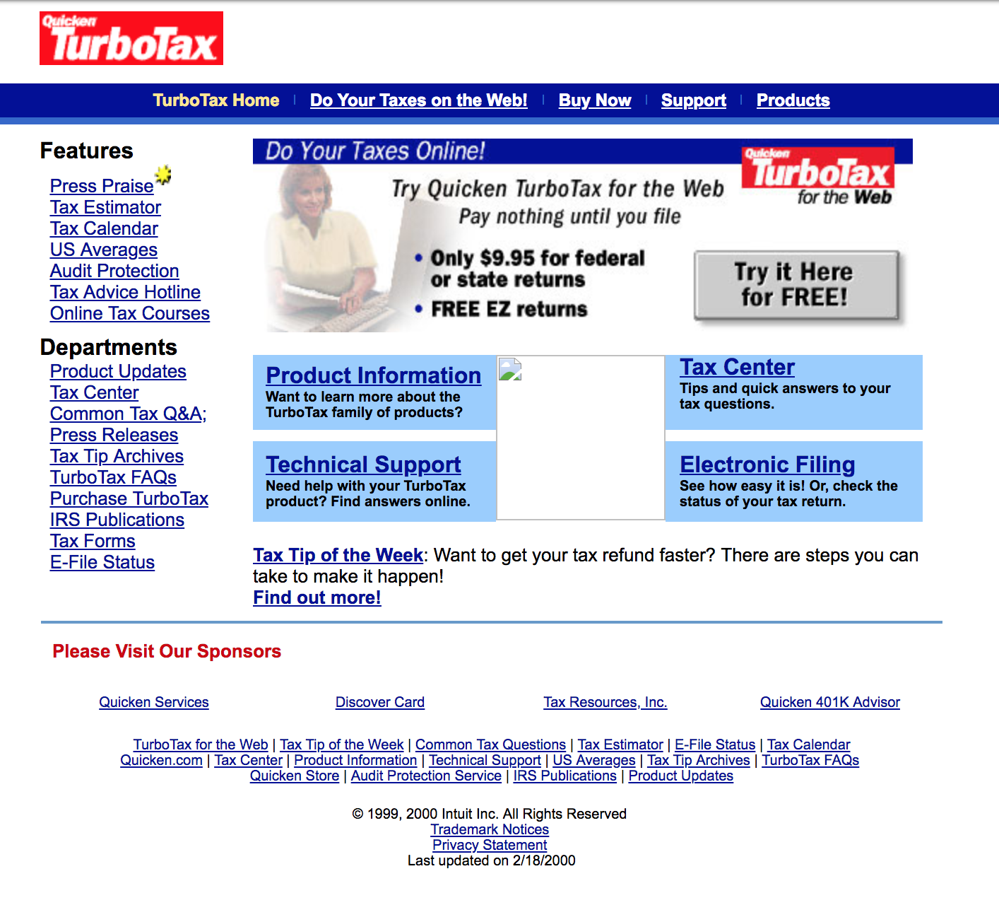
Fast forward to 1999. As millions of people around the world anxiously waited for airplanes to fall out of the sky and computer systems worldwide to crash due to the infamous “Y2K” computer bug, Intuit’s tax preparation software tool TurboTax was accessible online for the very first time. Although this is ostensibly the beginning of TurboTax’s story, the tale really began six years earlier, in 1993. That was the year that Intuit acquired tax preparation software company Chipsoft for $225M, the equivalent of around $390M in today’s currency.
During the early ’90s, Intuit was the leading developer of personal finance software products in the U.S. However, the company’s position was not uncontested. Microsoft’s competing product, Microsoft Money, was making aggressive gains against Intuit’s incumbent flagship product, Quicken. Intuit’s acquisition of Chipsoft was a strategic investment intended to fend off Microsoft’s advances and maintain Intuit’s position at the top of the personal finance software food chain.
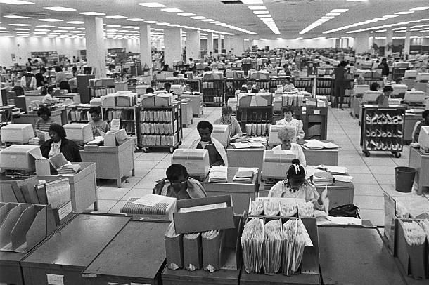
At that time, the notion of e-filing was still quite novel. Most taxpayers were used to filing paper returns. Besides being able to submit tax returns online rather than by mail, what made e-filing so revolutionary was that taxpayers were notified whether their federal or state returns were accepted or rejected within 24 hours. Prior to the introduction of e-filing, taxpayers often had to wait many weeks before being notified whether their returns had been accepted. This was just one aspect that made e-filing an inevitability, despite the apprehension of the taxpayer.
By the time Intuit launched TurboTax online, the company had a head start of several years in terms of product development. Not only had Intuit inherited its tax preparation product when it acquired Chipsoft, it also had years to carefully observe developments in the e-filing system—and what taxpayers hated about it. However, Intuit had its work cut out for it in a technical sense.
When Intuit acquired Chipsoft—and, by extension, TurboTax—the product itself functioned similarly to the EFS pilot program in 1986. Three years before it was acquired by Intuit, Chipsoft introduced an add-on product for TurboTax called ChipLink, which essentially allowed taxpayers to bypass their tax professional and send their returns electronically via their home modem to a third-party company. This IRS-approved transmission company would then electronically file the returns with the IRS.
When ChipSoft debuted ChipLink in 1990, the tax preparation industry in the United States was worth just $60M—a paltry sum in comparison to the $11B tax preparation industry of today. However, the size of the tax preparation industry at that time isn’t important. What really mattered was the potential market that Intuit could target with its new products.
It’s not hyperbole to say that TurboTax’s online debut in 1999 was one of the most significant developments in taxation of the 20th century. Approximately 4.2M copies of the 1999 version of TurboTax were sold that year, and 38 states were accepting electronic returns. Intuit Chairman Bill Campbell told industry press that around one in five federal tax returns were filed using an Intuit product in 1999.
TurboTax’s online availability was certainly attractive to tech-savvy taxpayers who were fed up with paper returns, but TurboTax’s availability as an online product was not the only factor in the strong user growth Intuit saw in 1999. The company had also embarked on an aggressive sales promotion designed to preempt similar moves by competing products, such as Microsoft Money and H&R Block’s TaxCut tools. Intuit slashed the price of its range of TurboTax products to retain its dominant market share.
Intuit’s forceful two-pronged approach worked. It focused on building better products than its competitors, then ramped up sales to secure greater market share. By 2000, Intuit controlled 75% of the e-filing market in the United States. Although Intuit would ultimately lose some of its considerable competitive advantage during the coming years, this vital head start gave Intuit an edge it enjoys to this day.
Despite this success, Intuit had no time to rest on its laurels as consumers began to shift from physical products to online products. In 2000, year-over-year sales of TurboTax dropped 30%. Speaking to The Wall Street Journal at the time, analyst Roger Lanctot said that Intuit’s aggressive sales push in 1999 to preempt Microsoft and H&R Block had been successful in heading off Intuit’s emerging competitors and gaining a significant increase in market share. However, Intuit did not repeat its aggressive sales strategy in 2000, an oversight that Lanctot believed was at least partially responsible for such a dramatic drop in sales.
Although Lanctot’s analysis was sound, Intuit wasn’t overly concerned. The decline in sales observed between 1999 and 2000 wasn’t symptomatic of declining interest in TurboTax — it reflected a shift in consumer behavior that ultimately redefined how we think of and access software. Intuit’s decline in sales was restricted to physical copies of its software products. In the coming years, software companies and users would gradually move away from ownership of physical products toward the online subscription model we know today. Looking back, it would have been stranger if Intuit’s physical sales didn’t decline after TurboTax went online. Just one month into tax season in 2000, more than 875,000 taxpayers had begun to file their federal return using TurboTax, compared to the total of 240,000 federal returns e-filed the previous year. A further 259,000 state returns had been prepared using TurboTax in 2000, a number that would grow rapidly in the coming years.
“Four years ago we invested in creating the most reliable and easiest online tax preparation system in the belief that a large number of tax filers who traditionally spent a full day doing their returns by hand would migrate to the Web. As the numbers demonstrate, we enable consumers to file online with confidence.” — Bob Meighan, VP, Intuit Consumer Tax Group
Between 2000 and 2002, word continued to spread about TurboTax. Consumers were seduced by the product’s ease of use and the expedited returns processing, and Intuit’s many competitors were scrambling to copy much of TurboTax’s functionality. However, the promise of easier electronic filing and faster refunds weren’t the only things that were bringing frustrated taxpayers to TurboTax—Intuit was expertly leveraging the free elements of its product to ensure return business next tax season.
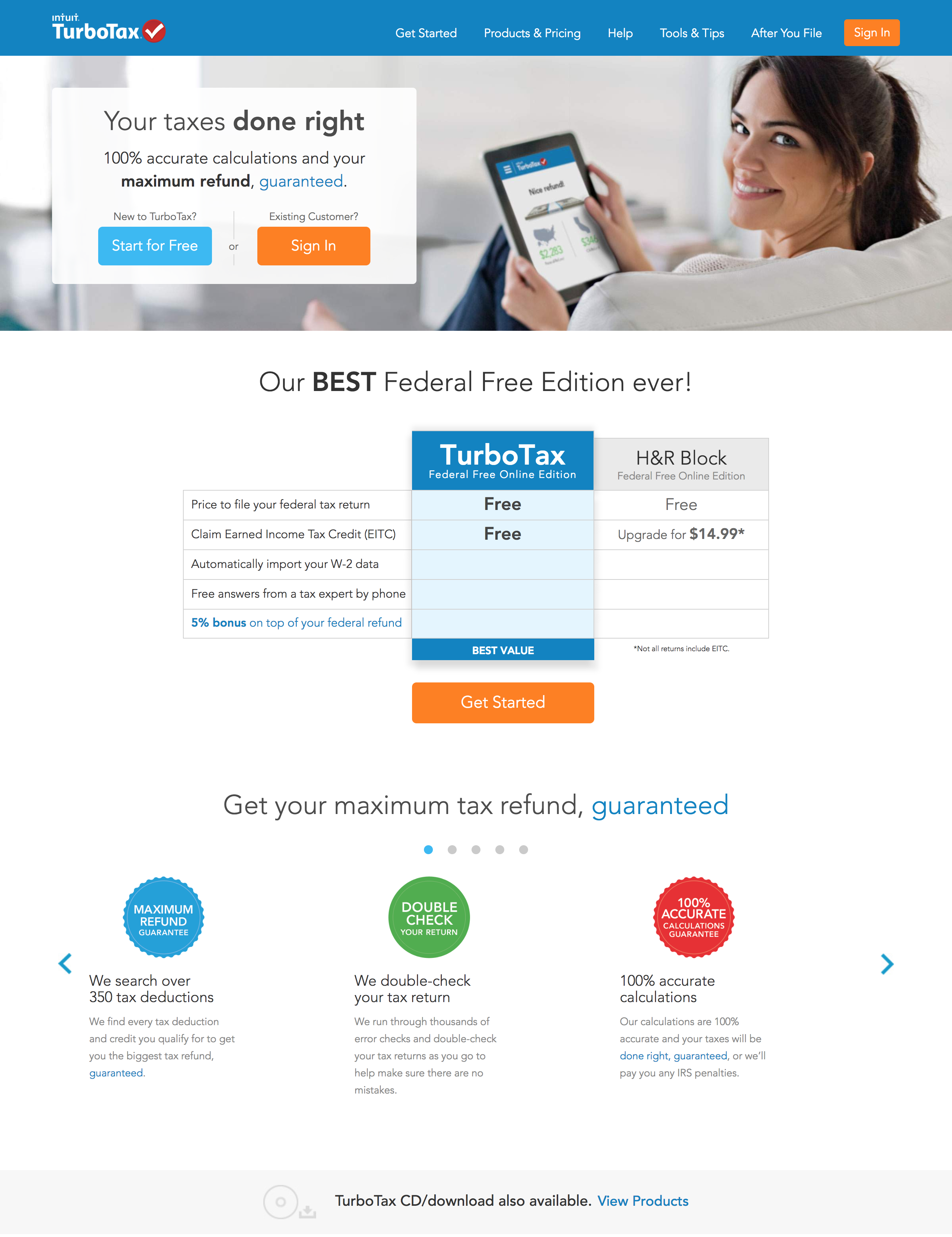
Unlike today’s online versions of TurboTax, which charge users a fee to file electronically that can be deducted from an expected refund or paid by card, TurboTax had no such restrictions in the early 2000s. For several years, TurboTax online users could file both state and federal returns completely free. This was a highly effective initial engagement strategy. Intuit had carefully listened to its customers over the years, identifying common taxpayer pain points and devising elegant design solutions to solve its customers’ problems. By combining TurboTax’s ease of use as a product with the financial benefits of free e-filing, Intuit was reducing as much friction as it possibly could to get people to try TurboTax and file a return. Once a user had seen how easily they could file their returns electronically for free, they would be significantly more likely to use TurboTax for their returns next year.
Although reducing friction and tempting users with advanced functionality is a defining characteristic of the freemium model, Intuit approached freemium differently than most companies. The freemium model was the dominant structure in tax prep in the early 2000s. What Intuit did differently was to make its freemium product as close to its paid products as it possibly could. This was reflected not only in the free product’s functionality, but also in its appearance. For all intents and purposes, the free and paid versions of TurboTax were practically indistinguishable.
“In the early 2000s, we used design to confront the shift toward ‘freemium,’ in which many of our competitors were offering stripped-down versions of their software free to people online, hoping to persuade them to pay for upgrades and more features. We resisted pressure to make our version plain. If we were going to offer a free product, we’d make it the most beautiful free product on the market. Our motto became ‘Delight, don’t dilute.’”— Scott Cook, former CEO, Intuit
Cook’s “Delight, don’t dilute” strategy worked incredibly well. The free online version of TurboTax was so popular with users, Intuit quickly secured 60% market share in the DIY tax preparation vertical. In comparison, Intuit’s closest competitor had just 18% market share. As persuasive and effective as Cook’s design-first ethos was, it wasn’t just a competitive differentiator. To Cook, it was central to the identity of TurboTax as a product and Intuit as an organization.
Adoption of TurboTax for the Web had increased steadily since launch, but 2002 was an incredible year for Intuit. More than 1M taxpayers used the free version of TurboTax for the Web to file their federal returns. The number of federal returns filed through the paid TurboTax product rose to 2.1M, an 80% increase from the 1.2M returns filed the previous fiscal year. TurboTax itself was already a strong product, but that wasn’t what propelled Intuit to dominance of the tax preparation vertical.
TurboTax grew rapidly because Intuit smartly targeted taxpayers who were still relying on paper returns, as opposed to tech-savvy taxpayers who were using other tools. Intuit couldn’t discount the threat posed by competing products entirely, but choosing to target weary, frustrated taxpayers who had never used a product like TurboTax was brilliant. Not only was this a considerably larger market for Intuit to go after (and ultimately dominate), it also represented what Intuit did best as an organization—as former Intuit CEO Steve Bennett once noted, Intuit specializes in “things you have to do, not want to do, that have deadlines, and that have repercussions if you do them wrong.” This combination of product-market fit and institutional expertise made Intuit a serious threat.
Intuit had managed to secure the lion’s share of the e-filing market early on. By 2004, Intuit had annual revenue of almost $2B, and the company’s growth showed no signs of slowing down. In a record-breaking year for e-filing, the IRS reported a 12% increase in the number of electronically filed returns in 2004, in addition to a 21% increase in the number of people filing their own returns using tools like TurboTax. However, as the company soon realized, it would have to work hard to retain its competitive edge. This would mean a concerted push toward the mobile market and a radical reevaluation of TurboTax’s design and the experience of using the product.
2008-2013: Intuit Goes Back to Its Roots, Doubles Down on Design
By 2008, the landscape of consumer technology had changed enormously. Generally speaking, consumers were growing much more accustomed to using the internet, even those with little experience with computers or the World Wide Web. The launch of Apple’s iconic iPhone in 2007 had brought with it a renewed sense of optimism and excitement about the role of technology in our daily lives.
You could be forgiven for assuming that the gradual transition to our Web 2.0 future was great news for Intuit, considering its rich history of innovation in design and its customer-first philosophy. However, by 2008, Intuit had begun to lose its way as a design-focused company. In order to grow its userbase—and revenues—Intuit had been focusing almost entirely on solving its users’ problems.
It had devoted far less attention to what the experience of using TurboTax actually felt like.
“Ease of use and design are slightly different things, and we had become overly focused on adding incremental features and functionality that delivered ease but not necessarily delight. We needed to think about emotions—how customers felt about our products and whether they took pleasure in using them.” — Scott Cook
Intuit’s problem-focused development process had made actually filing tax returns electronically much easier. What the company had neglected was how users felt using TurboTax. As TurboTax continually added new features and functionality, it unwittingly lost its way as a simple tool to help people do their taxes—precisely what had made TurboTax so popular in the first place. While this change in product philosophy had been unintentional and gradual, it was a significant departure from the design-first mentality that had made Quicken so popular with consumers in the early ’80s. Intuit had a solid product, but little clear direction. This changed when Scott Cook assumed the mantle of Chief Executive Officer in 2008.

Despite his lack of formal design training, Cook had been working in human-computer interaction for years, and almost single-handedly changed how Intuit viewed design as an element of its product development workflow. Although Cook’s official title was CEO, he could as easily have been Intuit’s design evangelist, and he wasted no time in winning the hearts and minds of Intuit’s product managers, designers, and engineers. Cook challenged everybody in the company, even the company’s accountants and attorneys, to think about how design could make their work more meaningful and impactful to the consumer. When Cook learned that many Intuit employees admired the design sensibilities of companies including Apple, Facebook, and Google, he vowed that Intuit would be one of the most design-driven companies in the world by 2020, and his “Design for Delight” philosophy would be the foundation of this ambitious goal.
Some might point to Intuit’s burgeoning identity crisis in the early- to mid-2000s as evidence of poor leadership or the lack of a unified, guiding vision for the company. In reality, Intuit had been doing everything right. The company had focused on solving the most painful, urgent problems of its users and making it as easy to solve these problems as possible. This approach was essential to the product’s survival. What made Cook’s design-first mentality so crucial to TurboTax’s continued success was that it encompassed the entirety of a typical user’s experience with TurboTax as a product and Intuit as a company. TurboTax made it easier to complete and file tax returns online, but to Cook, the user experience didn’t begin when a taxpayer started to complete their federal return—it started the moment that taxpayer began to think about filing their return online and continued long after their returns were submitted to the IRS.
Cook had not only smartly recognized design as the major potential differentiator it is, but also realized that applying design principles to financial software was an immense challenge. Few could argue with the need for TurboTax as a product, but whether it was even possible to leverage positive emotional triggers in tax preparation software was much less certain. It was at this point that Cook decided to combine his product teams’ focus on problem solving with his design sensibilities. TurboTax would continue to make users’ lives easier, but it would also emphasize the few positive emotional payoffs taxpayers typically experience when filing their returns.
“Consumers spend 6 billion hours each year using software to prepare their income taxes; anything we can do to reduce that time will be a gift. At the end of the process, most taxpayers are owed a refund—and for 70% of them, that refund is the single largest check they’ll receive during the year. In this context we began to think less about the pure functionality of our software and more about the emotional payoff of reducing drudgery and speeding the way toward a big windfall.”— Scott Cook
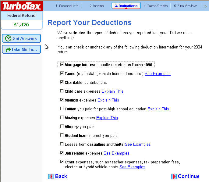
This insight was transformational, and began to shape every aspect of TurboTax’s development. TurboTax’s product teams combined the company’s renewed focus on design with the problem-solving, feature-driven development process that had made TurboTax so popular. In 2010, TurboTax introduced functionality that allowed users to import documents and data from previous returns, which reduced how many questions they had to answer. Task flows were simplified in certain circumstances, such as for married couples filing jointly, to avoid having to ask for the same information twice. New prompts and messages were added to give users a better idea of where they were in the e-filing process. With every design tweak or addition, TurboTax became better at solving problems in a way that genuinely delighted users.
One problem whose solution remained elusive, however, was how Intuit could combine its popular tax preparation software with the shift away from desktops toward mobile devices. TurboTax had managed to streamline the average federal tax return filing process significantly, but the idea of filing a tax return on a smartphone seemed too large a leap, even for Intuit.
That didn’t stop the company from trying.
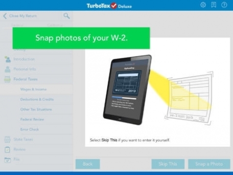
That same year in 2010, Intuit began experimenting with an iPhone app called SnapTax among a small group of beta users in California. The idea wasn’t necessarily to create a way for users to prepare, complete, and file a return entirely on their smartphone, as much as a way to make the data-gathering aspect of filing taxes a little easier. The idea behind SnapTax was to allow users to take a photo of their W-2 form on their smartphone, then upload that data to TurboTax via the SnapTax app.
Optical character recognition technology is commonplace today (especially among fintech startups), but at that time, it was still a nascent technology with few proven use cases. Many people expressed doubts that SnapTax was even a viable idea, but Intuit forged ahead because it was laser-focused on anything that could make its customers lives’ easier.
Customers didn’t just like it. They loved it.
The company may not have intentionally set out to create a way for taxpayers to file entire returns on their smartphones, but Intuit soon realized that some users were indeed completing and filing their returns just using SnapTax. Just two weeks after launch, SnapTax had supplanted Angry Birds as the most popular app on iTunes. After a few weeks, more than 350,000 people had downloaded the app. The tool was so popular it was later incorporated as a core function into TurboTax’s iPad app.
“We tested more and more. Our eyes were opened. The customers were clearly thinking of the smartphone as a small computer. They were asking ‘Why do I have to go back to my computer?’ And we saw the same behavior and opinion from other customers when testing subsequent prototypes.” — Carol Howe, Senior Product Manager, Intuit
By the end of 2013, TurboTax had listened carefully to its user base and had implemented a raft of features and functionality based explicitly on that feedback. It had refined its product to align with shifts in how consumers were beginning to think—and feel—about taxes and e-filing. However, although Intuit’s primary strategy had been to develop a superior, best-in-class product to secure its dominant market share, the company would soon leverage other means to ensure it remained on top—lobbying lawmakers in the nation’s capital.
2013-Present: People, Personalization, and Political Power
Although it bore little resemblance to its earliest predecessor, TurboTax was almost 30 years old by 2013. Intuit had learned a great deal about its customers in the two decades since it acquired Chipsoft. The company had cleverly used design and emotional triggers to create a more rewarding, engaging, and simplified tax experience. However, while Intuit had championed simplicity and ease of use in its software for 30 years, the company hasn’t always been the advocate for taxpayers it has claimed to be.
In 2004, a Stanford tax law professor called Joseph Bankman introduced an experimental pilot scheme in California known as ReadyReturn. The idea was that, since the state already had so much information about taxpayers across California, the state treasury would use this data to create pre-populated returns for the 11,000 taxpayers who participated in the pilot. Many countries already have similar systems in place, including Denmark, Sweden, Estonia, and the United Kingdom. After reviewing the state’s pre-prepared return, taxpayers could either accept the return as accurate or dispute it and file a return manually in much the same way we do now.
“Filing taxes each year, it’s one of the most important interactions you’ve got with your government. And how does it make you feel? It makes you pissed. You can’t understand it. You’re anxious. You’re worried about screwing up.” — Joseph Bankman
ReadyReturn was immensely popular with the participating taxpayers. Almost all of them said they would happily use ReadyReturn again in the future. Treasurers in several other states began asking Bankman how they could implement streamlined, pre-prepared returns in their own states. Austan Goolsbee, who served as economic advisor to former President Barack Obama, estimated that return-free filing proposals like Bankman’s would apply to almost half the American population, and would save taxpayers up to 225 hours in time spent and more than $2B in tax preparation fees every year.
At the eleventh hour, however, Bankman’s proposal was shot down in the California state legislature. The bill was one vote short of the total needed for the measure to pass. Intuit had reportedly spent more than $500,000 in Sacramento lobbying against Bankman’s ReadyReturn system. Tax simplification bills similar to Bankman’s were introduced again in 2007, 2008, and 2010. Each time, the bills were defeated—and Intuit spent a fortune making it happen.
Between 2011 and 2015 alone, Intuit spent roughly $13M lobbying the federal government to fight proposed simplifications to the American tax system. More broadly speaking, tax preparation companies have spent an incredible $28M lobbying the federal government since 1998—more than $20M of which was spent in the five years from 2008 to 2013. This isn’t just bad optics; it’s an example of how a company with a history of innovation opted for a defensive play to control its existing business rather than playing to win by consistently innovating and making customers’ lives easier.
Given the existential threat to its business posed by tax simplification proposals, it’s hardly surprising that Intuit would invest heavily in political lobbying. However, what’s most interesting about Intuit’s position is that, while its lobbying efforts are understandable from a business perspective, the company’s attempts to maintain the status quo stand in direct opposition to everything TurboTax represents as a product. Intuit had spent twenty years crafting a product ostensibly designed to make taxpayers’ lives easier, while simultaneously spending millions of dollars to persuade elected officials to sabotage measures that genuinely would make taxpayers’ lives easier. It contradicted Intuit’s broader messaging, sent mixed signals to consumers, and cast doubt on the sincerity of Intuit’s mission.
“The risk of federal and state taxing authorities developing software or other systems to facilitate tax returns preparation and electronic filing at no charge to taxpayers… may cause us to lose customers and revenue.” — Intuit Securities and Exchange Commission filing, 2012
Although Intuit spent much of the period from 2013 onward flexing its political muscle, the company also made significant improvements to TurboTax as a product during this period. Mirroring broader trends in digital, Intuit began making the TurboTax experience more personal. To accomplish this ambitious goal, Intuit hired Kurt Walecki, a renowned designer who was tasked with unifying and improving the user experience of TurboTax.
Soon after joining the company in 2013, Walecki spearheaded an internal initiative at Intuit called Ignite. In a return to Intuit’s roots, the entire company shut down over a two-day period and every single employee boarded buses and ventured out across San Diego to learn more about how people filed their taxes. More than 1,400 residents were polled as part of the Ignite project, and this data formed the basis of much of TurboTax’s development over the next five years.
Walecki began by examining user flows. It didn’t take long for Walecki to realize how much redundancy was built into the current user flows. Even if a user specified their occupation in one section, the system still asked them if they were farmers (who are taxed differently than most other occupations), despite already having been provided with data to the contrary. To combat the frustration and wasted effort created by inefficient user flows, Walecki designed and introduced a new “tile” system that asked users a series of questions without forcing the user to leave the current screen. Depending on their answers, TurboTax would filter the remaining steps in the process to ensure users weren’t wasting time answering questions that were irrelevant to their tax situation. This was a simple, yet clever, way to create a more streamlined experience, save users time, and help taxpayers complete their returns faster with fewer errors.
Another problem that Walecki tackled was the messaging of TurboTax in general. Walecki realized that, while TurboTax was a trusted brand, it didn’t connect with users the way other software tools did. This problem was hardly unique to TurboTax. Many fintech startups struggle to balance trust and credibility with accessibility and warmth in their messaging, and even Intuit was no exception.
Understanding that TurboTax had to appeal to and be understood by a vast cross-section of the American population, Walecki set about making TurboTax’s language and messaging friendlier and easier to understand. This was one of the smartest steps Intuit took during this period. In terms of functionality, there was little left for Intuit to add from one tax year to the next. This made the experience of using TurboTax one of the very few remaining differentiators for TurboTax as a product.
“We looked ourselves hard in the face between 2013 and 2014 and said, ‘Man, we’re like one step away from the IRS.’ Our language was very credible, but it was very tax-y and we thought this is not easy for anyone to understand deductions and credits and schedule fees.” — Kurt Walecki
Walecki and his team continued to adjust and refine TurboTax’s messaging. They introduced new language at key stages of the filing process to provide users with the emotional payoff of accomplishing smaller tasks. Users received congratulatory messages for completing individual sections of their returns. TurboTax’s language was friendlier, warmer, and more reassuring. Every change Walecki and his team implemented was designed to enrich the user experience and reward taxpayers throughout their journey.
However, one of the biggest challenges facing TurboTax wasn’t visual, but technical—creating a seamless, cross-platform experience that users could enter and exit at will at any stage of completing their return. In 2015, Intuit began work on the back-end systems that would allow TurboTax users to begin completing their return on their laptop and actually complete it on another device. Although this feature would make the overall experience of using TurboTax more convenient, it was designed to reflect broader trends in how people interacted with online products and services. By 2015, people were becoming increasingly used to using multiple devices throughout their day. Intuit knew that completing a tax return took a considerable amount of time, even with TurboTax’s assistance. By allowing users to begin filing their return on one device and completing it on another, Intuit was making TurboTax even stickier. Combined with the many other conveniences offered by TurboTax in recent years that further drove user engagement, such as TurboTax’s historical Document Center that allows users to quickly access previous returns and related documents, the cross-platform experience was a fantastic engagement strategy. It’s also a great example of how Intuit has responded to broader shifts in digital in a timely way that even some smaller, more agile, companies cannot.
Despite making a couple of potentially serious missteps in recent years, TurboTax remains a popular product and a household name—no easy feat for a SaaS product. However, tax preparation remains a contentious issue, particularly in light of recent tax reforms and heightened focus on Intuit’s political influence. If Intuit is to retain its dominance in the e-file market, it will have to go back to basics by listening carefully to its users, responding quickly to emerging threats and challenges, and fend off competing products by demonstrating a genuine commitment to making its users’ lives easier and putting their needs first.
Where TurboTax Could Go From Here
Few companies have combined the experience and functionality of primarily consumer-focused, B2C apps with a use case as “boring” and potentially complex as filing taxes with the effectiveness of TurboTax. Similarly, few companies face threats as grave as those posed by the federal government’s taxation policies as Intuit.
Although these challenges are unique, they’re also what makes anticipating TurboTax’s next move so exciting. Where could TurboTax go from here?
1. Further streamlining/simplification of TurboTax’s features.
As taxpayers and businesses prepare to wrestle with the practical implications of recent tax reforms, it is inevitable that TurboTax will continue to develop its product to emphasize simplicity and ease in light of the new IRS requirements. Intuit has proven to be remarkably responsive to legislative change in the past, and it seems highly likely that TurboTax will address these forthcoming rule changes quickly to avoid losing market share to competing products.
2. Entirely new tax products to reflect wider trends in employment patterns.
With the vast majority of job growth in the U.S. over the past decade attributed to self-employment and “gig economy” roles, it seems possible that Intuit could develop new tax products aimed at people navigating the new world of work, similar to its TurboTax Self-Employed product that was introduced in 2016. This could even result in splitting TurboTax into constituent products aimed at different categories of taxpayers, i.e., smaller, lightweight products aimed at specific types of businesses.
3. Strategic acquisitions of competing products.
Although TurboTax remains the dominant player in the e-filing software market, competitors such as TaxSlayer are gaining ground. In addition to pushing to acquire new users for its core TurboTax product, Intuit could strategically acquire competitors such as TaxSlayer or even bigger companies such as CreditKarma to further strengthen its position by offering more financial services to users, such as credit monitoring.
3 Lessons We Can Learn From TurboTax
Intuit may occupy a unique position in the SaaS ecosystem, but that doesn’t mean there aren’t valuable lessons that any entrepreneur can learn from the rise and rise of TurboTax.
1. You don’t need to operate in an “exciting” market to create great products.
It’s difficult to imagine an industry more boring—or intimidating—than tax preparation, yet TurboTax is genuinely pleasurable to use. This proves that great products are great products, regardless of how boring the task they help users complete may be.
If your startup is trying to solve problems in a “boring” industry, ask yourself the following questions:
- Think about what exactly makes your industry dull. How does your product combat this perception? TurboTax delights users by helping them accomplish a task that many taxpayers perceive as difficult, time-consuming, and potentially expensive. How does your product make your users feel?
- Are you genuinely solving problems, or just trying to create a market for your product? Most startups fail because of a lack of product-market fit. TurboTax succeeded because Intuit focused on the most difficult aspects of the tax preparation experience and cleverly leveraged emotional triggers to create a rewarding, engaging experience. How does your product do the same?
- How does using your product make your users feel? TurboTax helps users solve a tangible problem, but does so in a way that consistently offers a sense of accomplishment and satisfaction. How are you quantifying the emotional experience of using your product? How could you make your product not only more useful, but more rewarding?
2. Don’t confuse industry expertise with your customers’ problems.
TurboTax evolved as a product due to careful consideration of user feedback. It would have been all too easy for Intuit to mistake its institutional expertise in tax preparation with the problems its users found most frustrating.
Nobody knows your business like you do—but nobody knows your customers’ problems like your customers. This is an excellent example of how “customer-driven invention” has informed much of TurboTax’s product development. The best products solve problems we didn’t even know we had. Take a look at your industry and think about your product’s place within it:
- How big is the gap between your institutional knowledge of your industry and the needs, expectations, and problems of your users? (Notice the question is how big the gap is, not whether it exists or not.) In its early days, Intuit realized people were using Quicken for small-business bookkeeping, even though Quicken was not optimized for this use case. Put another way, are you solving problems your customers are genuinely struggling with, or are you forcing them to solve problems you think they have?
- How are you identifying your customers’ problems in the first place? Are you relying on firsthand research or assumptions? Are you even bothering to quantify your users’ problems? It might seem folksy compared to sophisticated market research methodologies, but hitting the streets and talking to real people was crucial to TurboTax’s growth. How are you getting this information—and what are you doing with it?
- Assuming your product helps your users solve a tangible problem, how does your product make your users feel when they solve that problem? Are they relieved to be done with the entire endeavor, or do they feel a sense of satisfaction or accomplishment? How does your product’s messaging reflect the desired emotional outcome of using your product and solving that problem?
3. Creating a rewarding, emotional experience is a powerful differentiator.
Although Intuit was quick to seize and retain sizable market share in the tax preparation space, TurboTax is far from the only tax software tool available today. However, Intuit has managed to consistently fend off its competitors by continually refocusing on the emotional payoff of successfully filing a tax return and leveraging this payoff through its messaging.
Think about your product and ask yourself the following questions:
- What kind of emotional state is your ideal customer in when they first encounter your product? Are they desperate or determined? Afraid or excited? Confused or confident? Understanding the emotional state of your customers is crucial to growth, but it’s vital to filter that understanding through the lens of the customer journey. Even two customers with the exact same problem might not come to your product in the same emotional state, especially if they’re at different stages of the typical sales funnel. How does your product address this?
- Think about the kind of emotional response you want your users to have while using your product. Why do you want your customers to feel this way? What does your product do to facilitate this? How will achieving this emotional response help your business grow?
- What aspects of your product genuinely delight your users? Can you incorporate these elements into other parts of your product? Is there a connection between your product’s most popular features and the underlying problem your product aims to solve? If so, how can you strengthen this connection? If not? Well, you might be trying to solve the wrong problem entirely.
Don’t Mess with Taxes
Although Intuit has made a few missteps over the years, TurboTax has dominated the tax preparation industry for decades because it solved a boring, difficult problem better than any other product. Securing consumer buy-in at scale by improving and leveraging a freemium model and creating an entirely new tax preparation experience both drove adoption and ultimately led to a financial SaaS product becoming a household name. Intuit even managed to make tax preparation an emotionally rewarding experience, which is a triumph of design and innovation in itself.
Intuit has also cleverly leveraged its considerable institutional expertise over the years. However, the company has never shied away from getting back to basics and listening carefully to its customers—a lesson that every entrepreneur and founder could learn from.

