How Pinterest Became an $11 Billion Company by Organizing the World’s Hobbies
Many startups seem to think that the only way to succeed is to entice early adopters in the tech industry into using their product. There’s no denying that a viral product launch in Silicon Valley can have a seismic impact on a company’s growth trajectory. However, far too many companies focus on attracting tech-savvy early adopters, often to the detriment of their products, their companies, and ultimately, their users.
Ben Silbermann, Evan Sharp, and Paul Sciarra wanted to do things differently. They wanted to build a product that everybody—not just techies in the Bay Area—could find useful. They wanted to create a product that was new, original, and yet, familiar. They wanted people to understand how their product worked instantly, even if they’d never heard of it before.
That product was Pinterest.
Pinterest grew to become an $11 billion business by focusing relentlessly on the users the company had, not the users it thought it should have. What’s fascinating about Pinterest is that it was the first online product that leveraged how we interact with things in the real world to help users organize their digital lives.
Here are some of the points we’ll be exploring in this article:
- How Pinterest’s early growth was driven by focusing on the users the company had
- How accessibility and ease-of-use have shaped Pinterest’s growth and development as a product
- Why Pinterest’s relentless focus on its user base has been so critical to the company’s continued survival
For all its user-friendly features and intuitive UI, Pinterest has always been a strongly technical company. However, what shaped Pinterest’s growth trajectory wasn’t the service’s underlying technology—it was how Pinterest’s very human early users used the platform, and how the company responded.
2009—2012: Building a ‘Human Indexing Machine’
By birthright, Ben Silbermann should have become a doctor.
With four physicians in his immediate family, he seemed destined to follow in his parents’ footsteps and join the medical profession. Except Silbermann didn’t become a doctor. He didn’t even go to med school. After graduating from Yale, Silbermann went to work for Google instead.
Silbermann worked in the search giant’s online advertising division. He didn’t regret his decision, but it didn’t take long for Silbermann to grow disillusioned with life at the Googleplex. Despite the company’s famous “20% Time,” his managers wouldn’t let him build anything. Naturally curious, Silbermann had always admired Silicon Valley luminaries like Steve Jobs and Bill Gates. He felt he was stagnating at Google. Eventually, tiring of his frustration and indecision, Silbermann’s girlfriend urged him to quit and pursue his own projects.
This is how Silbermann’s app development company, Cold Brew Labs, was born.
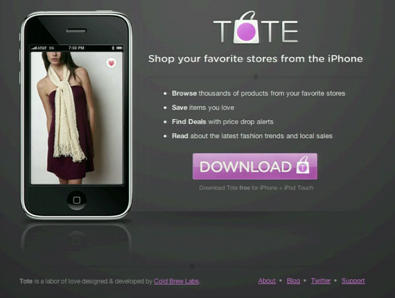
Cold Brew Labs was the brainchild of Silbermann and his former classmate, Paul Sciarra, who had recently quit his own job at New York venture firm Radius Capital. Cold Brew Labs’ first real product was a shopping comparison app called Tote, which launched in 2009 roughly six months after Cold Brew Labs was founded. Users could browse apparel and other goods from 30 retailers, save items as favorites, and receive push notifications when those items reduced in price. The app wasn’t particularly remarkable, but Cold Brew got the green light—and financial backing—from FirstMark Capital to develop Tote.
Unfortunately, it soon became evident that Tote wasn’t going to work out.
There were two main reasons for Tote’s failure:
- The app was at least five years ahead of its time. Shopping and e-commerce had not yet become mainstream in brick-and-mortar retail in 2009, and consumers weren’t using their mobile devices for shopping companion apps.
- Apple’s App Store was not yet ready to support cloud-based app companies. By the time Silbermann and Sciarra received feedback on Tote’s changelogs from the App Store, they’d already have another version ready for release. Apple simply couldn’t handle how quickly Tote (and other apps) were being developed.
Despite the apparent failure of Tote, it wasn’t a total loss. While analyzing Tote’s user data, Silbermann and Sciarra discovered something interesting. Tote’s users were using the app as intended. They were browsing for products and saving them using Tote’s Favorite function. But that wasn’t all they were doing. Many Tote users were finding new products through the app, then sending images of these products to themselves.
This collecting behavior gave Silbermann and Sciarra an idea.
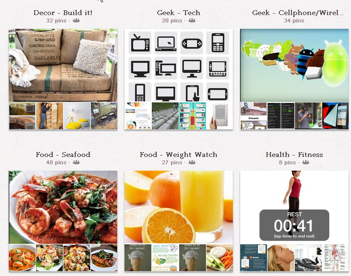
The two men started hacking together a prototype of a new product built using Tote’s user data as the foundation. They iterated on the product gradually. As they worked on the new product, they learned more about their users’ behavior. They soon realized, for example, that very few people searched Tote for brand-specific items. Instead, they searched by product category: shoes, dresses, pants, jackets. This led the team to develop the idea of “buckets” into which users could organize their collections of images.
Silbermann and Sciarra’s new prototype was largely finished by the end of the autumn of 2009. During a trip to New York City, Silbermann met Evan Sharp through a mutual acquaintance. Sharp understood what Silbermann and Sciarra were trying to do right away. Sharp would eventually leave New York and move west to California, where he worked as a product designer at Facebook before joining Silbermann and Sciarra to work on their project full-time as a third cofounder. Sharp’s influence on the emerging product was crucial. He is credited with not only coding the majority of the site, but also developing the distinctive grid layout that Pinterest still uses today.
Shortly after Sharp joined the team, Silbermann and Sciarra approached FirstMark about their new product, and convinced them that their prototype had even more potential than Tote. Although the commercial applications of Silbermann’s prototype were clearly evident, he was careful to avoid pitching it as an e-commerce app. Silbermann, Sciarra, and Sharp had a working product. Now all they needed was a name.
Over Thanksgiving dinner in 2009, Silbermann’s girlfriend offered an idea for what the app should be called—Pinterest.
The concept of collecting has been built into Pinterest from its very earliest iterations. Silbermann was an avid collector in his youth, having amassed an extensive collection of moths and butterflies he later jokingly described as “Pinterest 1.0.” However, although user behavior was crucial to Pinterest’s early development, the app’s initial audience was arguably as important—if not more so—than how that audience used the app. Many startups mistakenly assume that the only viable pathway to growth is to appeal to early adopters in the tech industry.
Techies often make ideal early adopters due to the likelihood that they will evangelize the technology and become de facto brand ambassadors. Facebook did this by targeting tech-savvy college students. Twitter did the same by appealing to journalists, bloggers, and the media. What’s remarkable about Pinterest is that it took the completely opposite approach. Instead of targeting developers in the Bay Area, Pinterest targeted homemakers in the Midwest and gave them something really valuable. While this seems completely counterintuitive to Pinterest’s trajectory as a consumer-focused startup, it worked brilliantly and broadened the product’s initial user base significantly.
When the earliest version of Pinterest launched in 2009, social media was already changing how we behaved online. Facebook already had more than 300M monthly active users. Even Twitter had almost 20M users. However, while Silbermann and Sciarra wanted to leverage the growing interest in social, they also wanted to distinguish Pinterest from the dozens of emerging social apps that were in development. Fortunately for Silbermann and Sciarra, they didn’t have to do a lot. Pinterest is unique among social media services. Facebook and Twitter tend to emphasize sharing updates about ourselves. Pinterest, on the other hand, emphasizes sharing things we like.
Silbermann and Sciarra had successfully developed a working version of Pinterest. The earliest versions of Pinterest were pretty rudimentary, and development of the site began in earnest in December 2009. In January, Silbermann posted the first ever image on Pinterest: a cardboard cut-out of a couple kissing on a bicycle.
Just a few months later in March 2010, Pinterest officially launched in closed beta. Shortly afterward, Pinterest transitioned to an invite-only open beta.
“I sent Pinterest to 200 of my friends, and I think 100 of them opened the email. It was catastrophically small numbers. I included a lot of people from Google and California, and I emailed a lot of people from Iowa. The people who started using it used it the way we had hoped. I think those few people kept Pinterest going.” — Ben Silbermann, Co-founder, Pinterest
Although many startups rely on the invitation model to drive early growth, Pinterest struggled to gain traction. To gain its first crucial users, Silbermann did much of the legwork himself. He emailed everybody in his address book. He scoured his contacts for email addresses, asked friends of friends for their emails, and even bombarded his former coworkers at Google in the hopes of spreading the word. Nine months after Pinterest went into open beta, the site had fewer than 10,000 users. Silbermann contacted roughly half these users personally and gave them his private cell number with an invitation to call him any time, day or night. Silbermann reportedly remained in touch with many of those 5,000 users for several years.
Determination is a vital characteristic for any entrepreneur, but in Silbermann’s case, good old-fashioned pride kept him going. The idea of begging for his old job at Google and admitting defeat was unthinkable to Silbermann. In his words, “The idea of telling everyone we blew it was so embarrassing. I thought, ‘Google is never going to take me back—they barely hired me the first time!’”
As Silbermann focused on growing the site’s user base, Sharp turned his attention to Pinterest’s design. Although Sharp’s grid-based design would ultimately prove very popular with users, it received a lukewarm reception in 2010. Kanban-style boards are ubiquitous today thanks to the popularity of services such as Trello, but in 2010, most social sites were preoccupied with text-based newsfeeds. Pinterest, by contrast, offered a visual way of organizing information that was polarizing even among Pinterest’s small userbase.
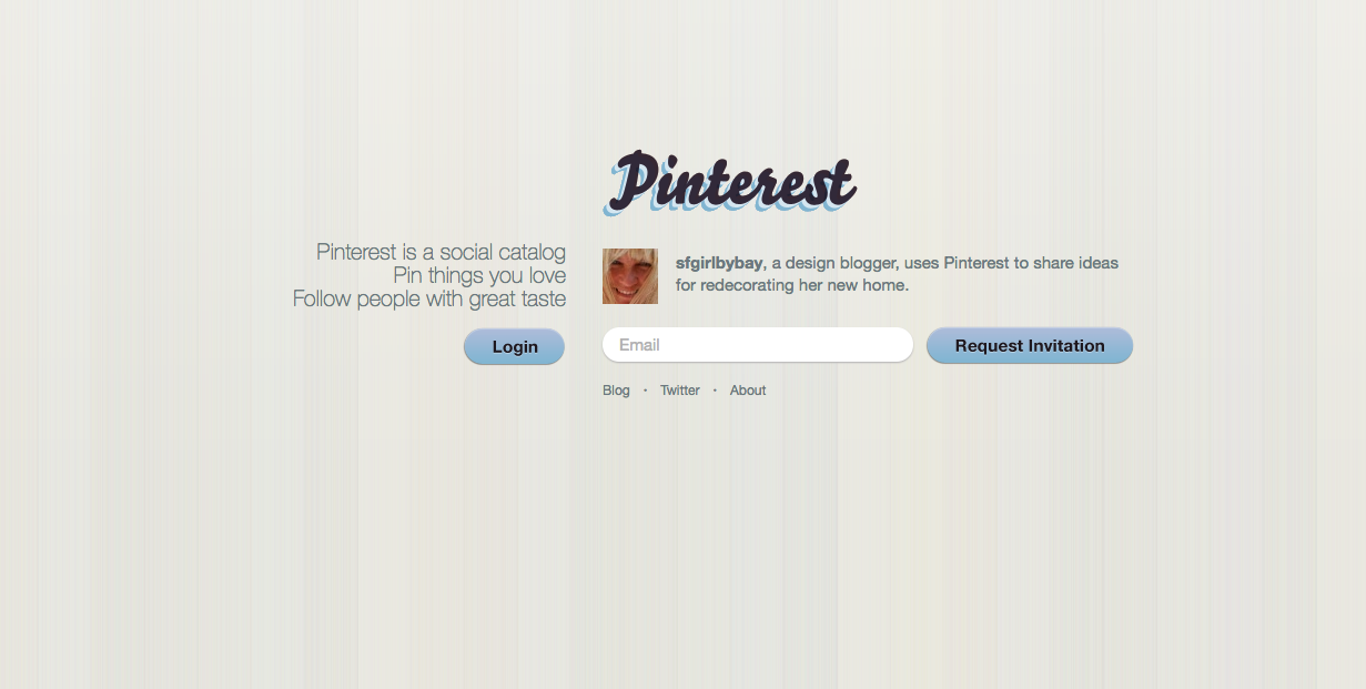
One aspect of Sharp’s grid-based design that surprised Silbermann and his team was how people responded to Pinterest’s grid-based layout. Early versions of Pinterest’s site featured a tagline that read, “Pinterest is an online pinboard. Organize and share the things you love.” This wasn’t just a way of introducing visitors to the idea of Pinterest. It was a way to prime visitors for what to expect when they used Pinterest.
The notion of online pinboards was still novel in 2010, but people already knew how to use a pinboard. They didn’t have to know what Pinterest was to understand and use it. Pinterest’s activation point—the point at which the user grasps how the product really works and starts to buy into it—is very strong because of this behavioral familiarity. Pinterest’s unconventional early adopters ensured that Pinterest had broad appeal across a wide range of demographics and interests from the outset. Its intuitive feel minimized friction between the site and the user by leveraging familiar behaviors from the real world.
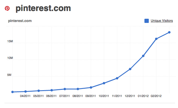
For most startups, success is a marathon, not a sprint. That said, many companies experience periods of intense growth—the long part of the hockey stick. For Pinterest, that year was 2011. The first of Pinterest’s major growth spikes followed the release of the first Pinterest app on Apple’s App Store in March 2011. Although the app lacked some of the features of the Pinterest we know today, the first iOS app looked and felt a lot like it does today. The app launch netted the growing company many more users than they originally anticipated.
The second major breakthrough came just a few months later in August, when TIME featured Pinterest in a “50 Best Websites” round-up. The app’s positive reception and the publicity generated by the TIME feature drew millions of people to the site. By December, Pinterest was among the ten largest social media services and was attracting more than 11 million unique visitors per week. This stunning growth led TechCrunch to declare Pinterest Best New Startup of 2011.
Things were finally going Silbermann’s way.
Pinterest continued to ride the wave throughout 2012. By August, Pinterest had more than 20M users and had raised $100M as part of its Series C round led by Japanese e-commerce giant Rakuten. Pinterest’s newfound wealth gave the company a valuation of more than $1.5B—more than even Instagram, which Facebook had acquired just one month earlier for a cool $1B. It also gave the rapidly growing company some much-needed capital it could use to support its runaway growth.
“We see tremendous synergies between Pinterest’s vision and Rakuten’s model for e-commerce. Rakuten looks forward to introducing Pinterest to the Japanese market as well as other markets around the world.” — Hiroshi Mikitani, CEO, Rakuten
By 2012, Pinterest had more than 11M users. One in five women who used the internet regularly were Pinterest users. The site’s invitation-only model had worked incredibly well despite the company’s early difficulties, and the company had achieved a valuation of more than $1.5B after just two years. However, the company was still struggling to nail down its identity and core mission—something the company would actively pursue in the coming years.
2013—2015: Mobile Growth, International Expansion, and Moving Toward Monetization
Rakuten may have seen “tremendous synergies” between Pinterest and its vision of e-commerce, but between 2013 and 2015, Pinterest just couldn’t nail down the monetization aspect of its business. Pinterest had grown dramatically thanks to Silbermann’s relentless focus on the site’s early users and Sharp’s intuitive design, but the company had largely ignored revenue generation in favor of focusing on product. That had to change—fast—if the company hoped to maintain the momentum it had established.
Pinterest kicked off 2013 with a bang by raising even more funding. The company’s Series D round, led by Valiant Capital Partners, scored Pinterest another $200M. At the time, Pinterest had around 100 employees. The company’s Series D round would help Pinterest hire more people—particularly engineers and product managers. The company got another injection of cash in October when it raised another $225M as part of its Series E round, much of which was also invested in engineering and product.
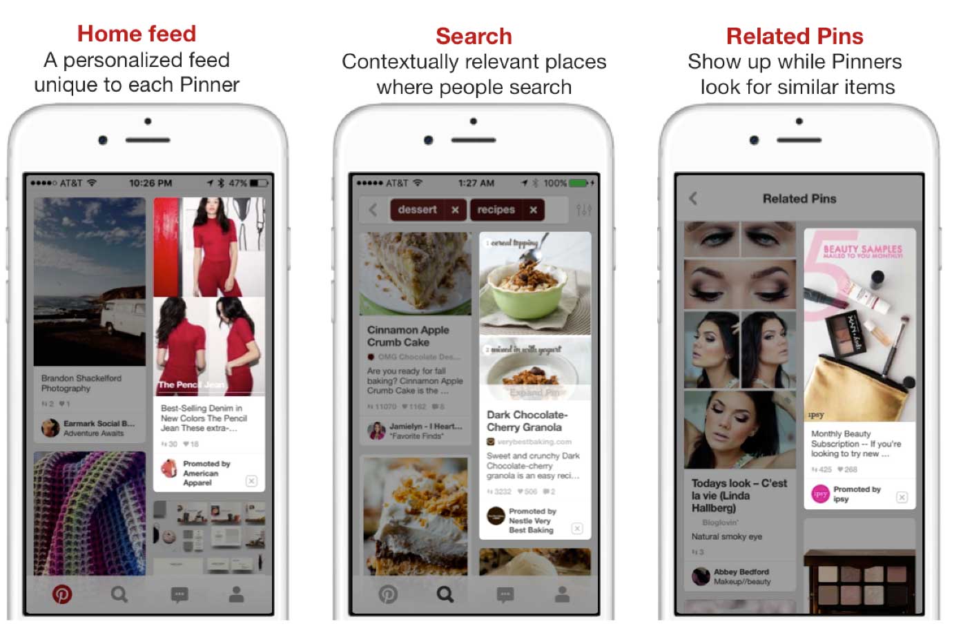
2013 also saw the introduction of what was the biggest update to Pinterest as a product thus far: Promoted Pins.
Functioning almost identically to Facebook’s Promoted Posts and Twitter’s Promoted Tweets, the feature allowed advertisers to promote their pins in prominent positions at the top of users’ feeds. Promoted Pins could be displayed at the top of search results and category feeds, and offered amazing visibility to advertisers.
Promoted Pins may not have been the most original concept, but Pinterest had learned a great deal from watching Google and Facebook develop their respective ad platforms. Just as Google redesigned its AdWords ad labels in 2016 and 2017 to make them harder to distinguish from organic results, Pinterest’s Promoted Pins blended into a user’s feed very well. Promoted Pins were only made available to a select group of advertising partners initially, but it was a vital first step toward monetization.
“Our focus is on helping millions of people discover things they love and get inspiration to go do those things in their life. This investment gives us more resources to help realize that vision.” — Ben Silbermann, Co-founder, Pinterest
Pinterest enjoyed incredible growth during this period. By the spring of 2014, Pinterest users had pinned more than 30B images, almost half of which had been pinned during the preceding six months alone. To leverage this immense repository of user-curated images, Pinterest unveiled two of the biggest updates to the service thus far in April 2014, Guided Search and Custom Categories.
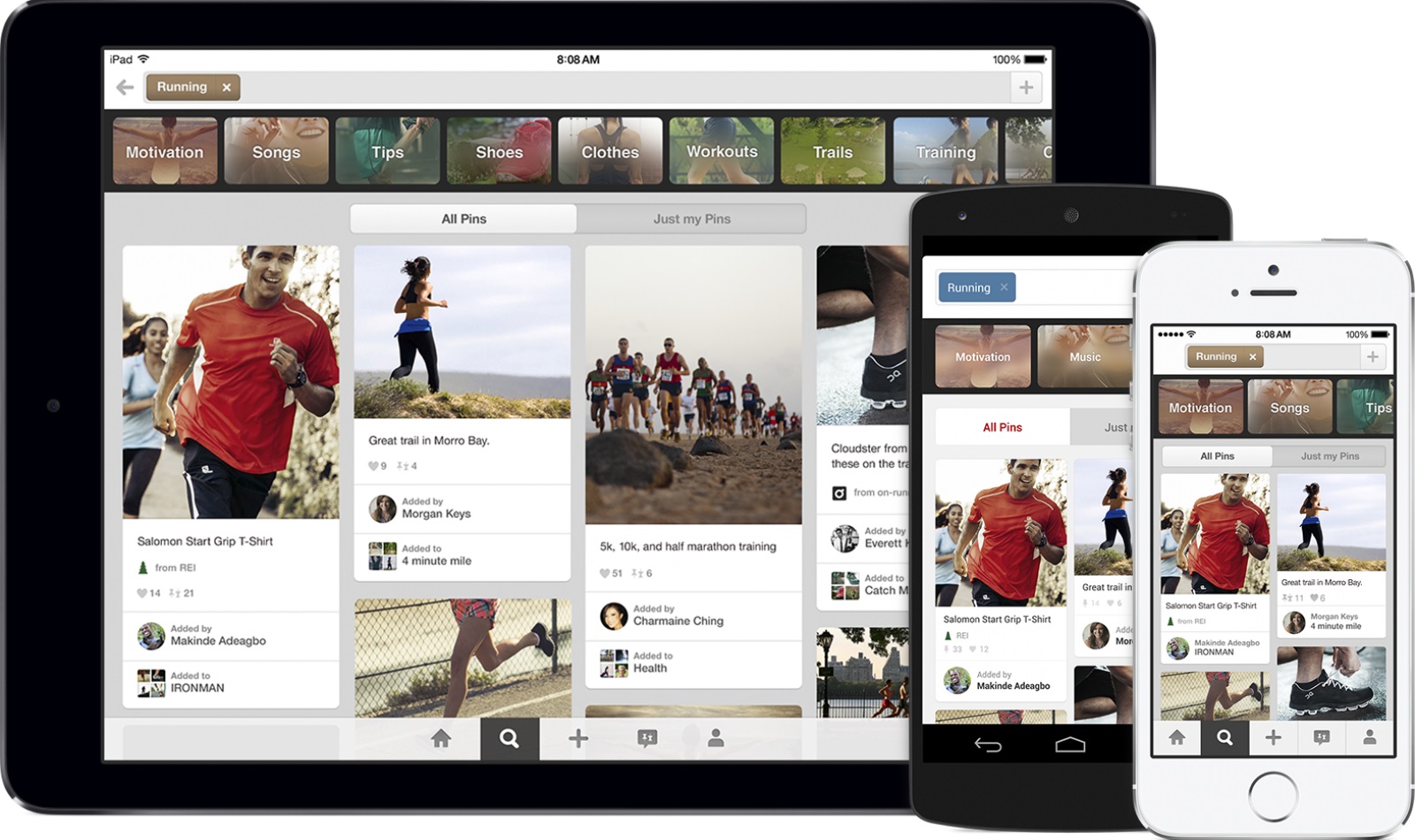
Guided Search, in particular, was hugely influential. The feature allows users to begin their search by entering a broad initial query, such as “men’s clothing.” At this point, Pinterest then begins guiding the user through a series of steps to refine their initial results by offering suggestion boxes for relevant subcategories. For example, in the figure below, the seed query is “running.” Pinterest then recommends semantically relevant subcategories, such as “motivation,” “shoes,” and “workouts”:
Look familiar? That’s because Google Images introduced the exact same feature into its search function in 2017—three years after Pinterest pioneered the idea. Aside from serving as an example of just how influential Pinterest was in 2014, Guided Search was a major step forward for Pinterest as a content discovery engine. Not only did the feature make it easier for users to discover new content, it made the site much stickier and more engaging. It also improved the chances that users would find exactly what they wanted, which made for a significantly more rewarding experience.
“Guided Search will help you discover when you didn’t know how to ask for things to begin with.” — Ben Silbermann, Co-founder, Pinterest
Custom Categories might not have been as immediately noticeable as Guided Search, but it’s another example of how Pinterest has continually responded to the changing needs of its diverse user base. By Silbermann’s own admission, the 32 initial categories offered to Pinterest’s early users were largely arbitrary and weren’t based on any real insights into the company’s users. Realizing that not everybody’s interests can be neatly categorized into so few sections, Pinterest introduced Custom Categories as a way to give users more control over their collections.
However, this wasn’t the real brilliance of Custom Categories. Pinterest may be a primarily visual way to discover and search for content, but Custom Categories relies on keywords and user-defined metadata—just like e-commerce sites do. Yes, Pinterest was responding to its users, but it was also laying the foundations for the kind of keyword-driven search functionality the site would need to monetize later on.
Pinterest continued to grow rapidly. By early 2015, Pinterest was approaching 50M users. The site wasn’t just attracting new users, though. Pinterest’s Series F and G funding rounds, which came in May 2014 and March 2015 respectively, totaled $567M, giving the company a valuation of more than $11B. By this point, Pinterest had accepted more than $1B in venture funding. The site was attracting users and capital at a stunning pace.
What Pinterest still hadn’t figured out, however, was how to monetize its rapidly growing user base.
“Pinterest has a lot of work to do to become a major player in digital advertising. It must work quickly to increase its user base, and fill out its ad product suite, which at the moment is fairly limited.” — eMarketer
The company’s Promoted Pins had enjoyed some success. However, Pinterest had a lot of work to do in order to appease its increasingly anxious investors. For an $11B company that had taken more than $1B in VC funding, its ad revenues were considerably lower than the company had anticipated. In September 2015, Pinterest announced it had surpassed 100M monthly users — yet the company’s revenue that year was just $100M. This was significantly less than the $169M in projected revenue that Andreessen Horowitz was using to entice prospective partners to join a special investment fund for the company earlier in 2015.
There are several factors to consider when it comes to Pinterest’s relatively sluggish success with monetization. The first is that Facebook had a vital head start on Pinterest in terms of advertising. By the time Pinterest introduced support for video and built its own native video player in 2016, Facebook had been enjoying strong revenue growth from its video ads for two years. However, aside from Facebook’s considerable competitive advantage with video ads (and advertising in general), one of the most serious problems facing Pinterest’s advertising team was that many advertisers were reluctant to reallocate their budgets from the proven success of Facebook to Pinterest’s cheaper—yet largely untested—Promoted Pins.
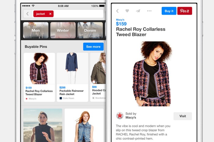
Advertisers’ risk aversion wasn’t Pinterest’s only obstacle to increased revenue. Pinterest had spent years carefully refining the experience of using the site to be as frictionless as possible for users and to make content discovery practically effortless. However, unlike other product-focused companies, Pinterest had developed a reputation for its cautiously methodical approach to product development. The company’s Buyable Pins and Marketing Developer Partners program were both rolled out in 2015, but Pinterest wasted precious time by rolling these features out very slowly.
Put another way, Pinterest was late to the monetization party.
By this point, Pinterest had built a strong user base in North America and parts of Western Europe. However, to sustain its strong user growth, the company needed to expand further. On April 1, 2015, Pinterest launched its Jumpstart program, an experimental initiative designed to help the company break into overseas markets more effectively. The Jumpstart team’s first destination? Tokyo.
“We pick the places we pick because they’re mature markets, they’re countries that lead their region culturally. The plan is really to develop a playbook to grow internationally. As much as their goal is to increase growth, we want to get more insight on how we should grow internationally.” — Evan Sharp, Co-founder, Pinterest
Japan is a popular choice as an entry point into overseas markets for American companies. As the world’s third-largest economy by GDP, Japan is a highly lucrative launchpad into Southeast Asia. However, for Pinterest, the choice to launch the Jumpstart program in Tokyo was highly strategic:
- Monthly active users in Japan more than doubled between 2014 and 2015
- Overseas activity accounted for more than 40% of all activity on Pinterest
- Rakuten’s financial and material support meant the company had the resources to develop a truly regionalized version of its app to test whether the localization model could be replicated elsewhere.
Despite strong growth overseas, Pinterest’s plans for world domination weren’t as simple as opening offices in exciting new locales. Pinterest might be a primarily visual service, but localization—a process that goes beyond translation that offers users a truly native experience—was still a major headache for the company. Translation was easy enough, but tailoring the overall Pinterest experience to appeal to a diverse range of cultural tastes was much more difficult.
However, Pinterest’s localization challenges weren’t purely aesthetic. Pinterest’s American users had responded positively to the site’s terminology, such as the act of “pinning” something to a user’s “board.” The same could not be said of the site’s Brazilian user base. In Brazilian Portuguese, a “pin” is something parents use to fasten their child’s diapers. The idea of “boards” was similarly lost on Pinterest’s Brazilian audience. To overcome this, Ricardo Sangion, Pinterest’s Head of Latin America, changed the word “pin” to “save,” and rebranded the site’s boards as “folders.” Not only did this eliminate some of the confusion and ambiguity surrounding Pinterest’s existing terminology in Brazil, it actually resulted in many more users saving items. This single localization experiment was so successful, the rebranded “save” was later rolled out across the entire site worldwide.
“For example, we recently updated the Pin It button into a save button. It’s a very visual change without any algorithm behind it. We tested the experience, and found that globally, ‘Save’ helped people better understand the value of Pinterest, and how to use the product immediately.” — Krishna Gade, Former Head of Data Engineering, Pinterest
Like any startup, Pinterest had taken risks and made mistakes, not least of which was failing to match revenue growth with user growth. Despite its few missteps, the company was growing. It had successfully broadened its reach beyond the U.S., and seemed poised to leverage its popularity and considerable resources to expand overseas significantly. However, while the $1B Pinterest had raised thus far had allowed the company to pursue ambitious expansion plans and hire a small army of engineers, it also put Pinterest under immense pressure to deliver results to shareholders—expectations that would soon intensify.
2016—Present: AI, Image Recognition, and Pursuing Profit
In just seven years, Pinterest had grown from a scrappy organizational tool for images into one of the most popular social media sites in the world. It had more than 100M users worldwide and Pinterest’s international user growth increased by more than 135% in 2015. It was the second-largest source of referral traffic on the internet after Facebook. Investor confidence was high—but their expectations were even higher. Shareholders had been patient with the growing site, begrudgingly waiting on the promise of an even bigger payday, but that patience would only extend so far.
By 2016, Pinterest had become a household name. The company had more than 150M users. The site was handling more than 2B searches every month. However, for all its progress and growth metrics, Pinterest had yet to figure out how to leverage its vast audience to drive revenue.
The company had long sought to position itself as a natural companion tool for shoppers—a throwback to Pinterest’s humble origins as Tote at Cold Brew Labs—but had largely failed to bridge the gap between discovery and sales. Silbermann and his team had known that their users were using Pinterest to collect and save things they were interested in buying. What they didn’t know was how to close that loop and make Pinterest an indispensable part of the cross-platform e-commerce experience. The site’s Visual Search function and Buyable Pins were steps in the right direction, but it wasn’t enough.
Except that wasn’t true. At least, not entirely. For years, Pinterest had been quietly developing its underlying technology to tackle one of the most difficult challenges in computer science, semantic visual search—and it was this technology that Pinterest hoped would finally solve its monetization puzzle.
Pinterest is most commonly compared to Instagram by virtue of the two platforms’ strongly visual nature. However, Pinterest actually shares more in common with Amazon. Why? Because the two companies set out to be the best at what they did by focusing relentlessly on their users, and in doing so actually became something else entirely. In Amazon’s case, it became the world’s biggest online retailer, but it also became the world’s de facto product search engine. There are several reasons for this:
- Amazon sells more products across more product categories than any other retailer
- Amazon’s purchasing power means it can often price products significantly lower than competing retailers
- Amazon’s superior logistics infrastructure—such as its one-hour Prime Now service—provides the kind of service that only premium logistics companies such as FedEx can offer, but at a fraction of the cost
Even if people ultimately buy something from a site other than Amazon, the chances are pretty good that they at least checked Amazon first. Similarly, Pinterest’s mission was to help people discover things they loved and organize them in a way that felt familiar. By making it as easy as possible to do so, Pinterest has actually laid the groundwork to become the world’s de facto visual search engine. It didn’t set out to do this initially. It happened organically over time, just as it did for Amazon.
Pinterest’s growing focus on visual search became strongly evident in February 2017 when the company unveiled two new product features that would shape the future of the product as a whole.
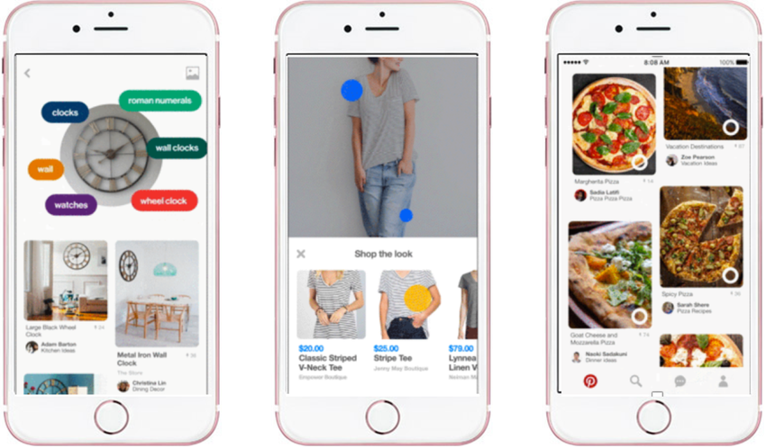
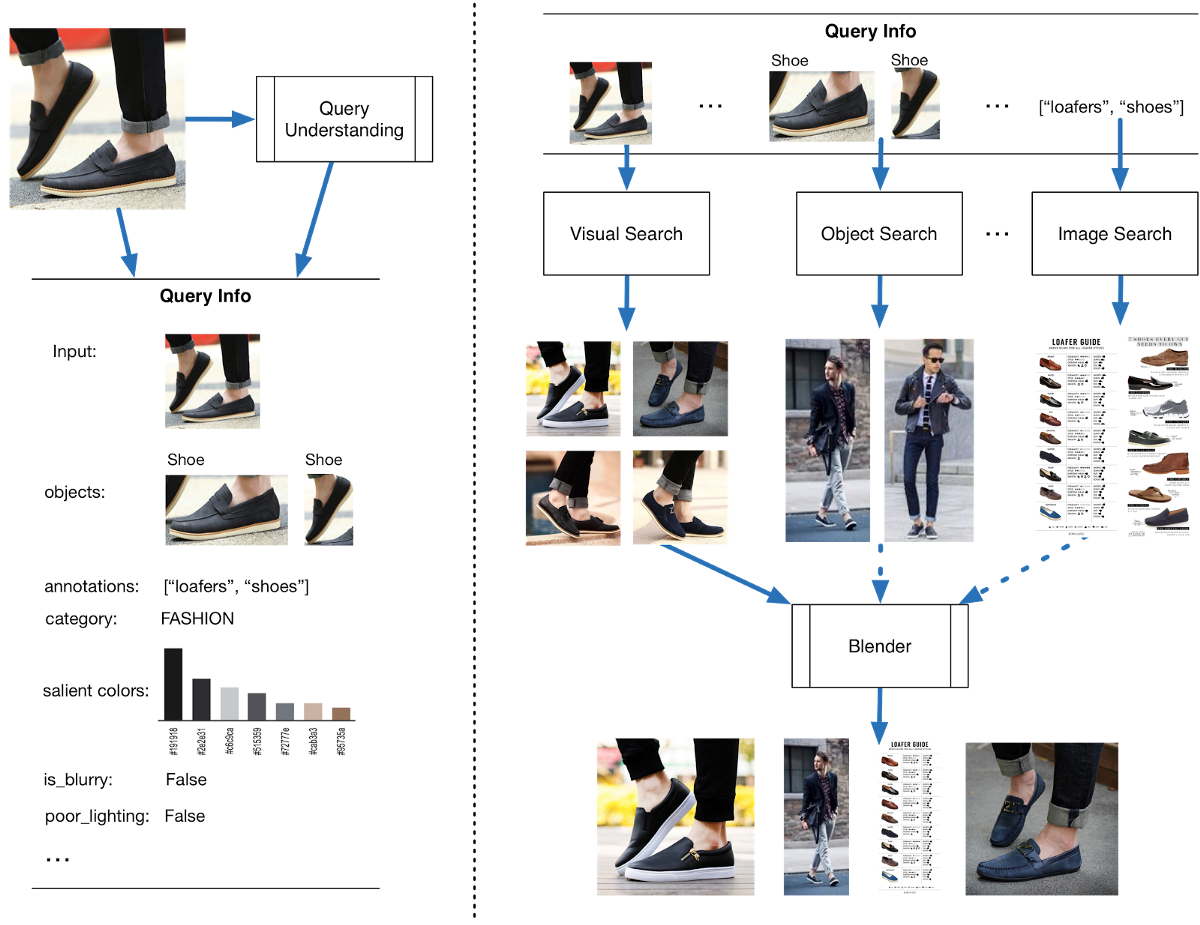
The first and most significant was Lens, Pinterest’s proprietary image recognition technology. First launched in beta on iOS, Lens allowed Pinterest users to capture images using their smartphone’s camera that Lens would then analyze and identify various objects in the image. As far as consumer computer vision goes, Lens was and is amazing. Being able to quickly and effortlessly identify distinct objects in a given image has incredible commercial potential, as it gives Pinterest users the means to not only identify, but also purchase, the things they see around them with virtually zero effort. This puts Pinterest as close as it possibly can be to those momentary impulse purchases that can be so difficult to isolate and optimize in the typical sales funnel, and minimizes friction at those crucial moments.
Launched simultaneously alongside Lens was Instant Ideas. This simple, yet highly effective, tool added a small circle beneath each pin. Users could tap these circles to be presented with a range of items and pins relevant to their original image. Instant Ideas might not have been as technologically impressive as Lens, but it was another crucial step toward dominance of visual search for Pinterest. Instant Ideas wasn’t just helpful—it was a logical, natural extension of how people search for things. Just as it’s all too easy to fall down a proverbial rabbit hole after an initial Google search, Instant Ideas allowed users to jump from one pin—and idea—to the next, seamlessly.
“Early information technology used words to connect ideas, like hyperlinks. But when it comes to searching for ideas, words aren’t the right way. Sometimes you don’t really know what you’re looking for until you see it.” — Evan Sharp, Co-founder, Pinterest
The company continued to invest in visual search R&D for much of 2017. In February of 2018, Pinterest successfully persuaded renowned computer vision specialist Chuck Rosenberg to leave his position at Google and become Pinterest’s Head of Computer Vision. Rosenberg was tasked with spearheading and improving every aspect of Pinterest’s computer vision technology, including its Lens project.
Pinterest has always been a strongly technical company. Unlike other sites and social media services, however, Pinterest has never marketed itself as a technology company. For the most part, its core user base doesn’t care what makes Pinterest work—they only care about what it does. Pinterest’s Lens technology is hugely impressive from a technical perspective, but most Pinterest users couldn’t care less about confidence thresholds or blending ratios or salient color computation. They only care about how it can help them find a lampshade to match their new throw cushions or a pair of running sneakers they can coordinate with their new leggings.
The underlying tech behind Lens may not be particularly enticing to most Pinterest users, but retailers couldn’t wait to get their hands on it. In 2017, Pinterest partnered with Target on a pilot program in which Pinterest users could take pictures of merchandise in Target stores, and Lens would offer suggestions for visually and thematically similar items on Pinterest.
Although results were restricted to items available from Target stores and did not include results from competing retailers, the initiative was a hint of things to come. As Pinterest has struggled to successfully monetize its platform, strategic partnerships with major retailers are likely to feature prominently in Pinterest’s plans to leverage the site’s immense commercial potential.
“We’re now in a place where we’re using Pinterest as a service to power some visual search for other products. I think there’s an opportunity for retailers to be a little more of a prominent player when it comes to visual discovery.” — Amy Vener, Retail Vertical Strategy Lead, Pinterest
By 2018, just eight years after Silbermann, Sharp, and Sciarra first unveiled their prototype, Pinterest had become a social behemoth. The site had almost 250M users, more than 100M of which were outside the U.S. More than 1B boards had been created. Users had pinned more than 50B images. What investors really wanted to see, however, was revenue growth.
Pinterest missed its revenue targets for the first half of 2017, but overall, the company appeared to be reasonably financially healthy. Revenue grew by 58% in 2017, softening the blow of its missed revenue target. The company could have definitely leveraged its commercial potential more effectively, but Pinterest’s revenue growth over the past four years has actually been quite impressive:
- 2014: $24M
- 2015: $139M (479% growth)
- 2016: $298M (114% growth)
- 2017: $472M (58% growth)
Despite modest revenue growth in recent years, Pinterest still faces an uphill struggle. Pinterest grew incredibly quickly because people already instinctively understood how Pinterest worked and it appealed to a very broad and diverse audience. While Pinterest had taken some steps to monetize its service over the past eight years, much of its attention had been spent on developing Pinterest as a product. If the company hopes to survive, it must monetize—and fast.
Where Could Pinterest Go From Here?
Pinterest’s journey has been anything but conventional. There are several potential directions in which the company could go—although some moves are more likely than others. Where could Pinterest go from here?
1. Pinterest goes public.
Pinterest has to go public. It’s taken too much VC funding not to—the only real question is when. The company still has to figure out how to compete with Google and Facebook’s stranglehold over the online ad space, but signs are pointing to an IPO in mid-2019, based on strong revenue growth and advertisers’ attraction to its search technology on mobile.
2. Renewed focus on smaller businesses/advertisers.
One criticism of Pinterest’s efforts at monetization thus far is that the platform has been largely inaccessible to small business advertisers (whether real or perceived). This is a problem that also plagued Instagram during the earlier days of its own monetization efforts, particularly as it partnered with nationwide retailers such as Target.
A likely move for Pinterest is to make this aspect of its platform more accessible, which will significantly boost revenues. This could be accomplished by introducing further pricing tiers to accommodate advertisers with more modest ad budgets, or even the implementation of locally focused ads to appeal to small businesses that rely on local search.
3. Heightened emphasis on visual commerce.
One of Pinterest’s greatest weaknesses is its dependency on search. To achieve its urgent monetization objectives and move beyond search as a critical weakness, Pinterest could invest significantly in becoming a visual commerce platform; just as Amazon has become the most popular de facto product search engine, Pinterest could shift to become a primarily visual way of searching for things to buy. This aligns strongly with the aspirational qualities of Pinterest as a product, and could be built upon Pinterest’s existing features such as Buyable Pins and its Lens technology.
3 Lessons We Can Learn From Pinterest
Pinterest has learned some valuable lessons over the past eight years, but what lessons can Pinterest teach us?
1. Identify early adopters for the product you’re building.
Pinterest could have gone in a very different direction if it hadn’t listened so carefully to its users and responded to how they were actually using the platform. The company purposefully chose to target Pinterest at users other than the typical Silicon Valley types who most tech companies chase in their early growth stages, which largely defined the company’s entire growth trajectory and development as a product.
Take a look at your product and your roadmap for the next six months, then ask yourself the following questions:
- When you first launched your product, why did you target the users you did? What made that group or demographic a good fit for your product or service?
- How does your product roadmap reflect the needs and desires of your early adopters? How does your product solve those users’ problems or make their lives better? Put another way, are you developing your product to cater to the early adopters you have, or trying to attract the kind of users you think you should have?
- What are you doing to stimulate growth among your core user base? In Pinterest’s case, the invite-only model worked incredibly well once the company overcame its initial struggles to gain traction. How can you appeal to your core audience and encourage your users to become evangelists for your product?
2. Continuously listen to your user base.
During Pinterest’s earliest days, Ben Silbermann emailed the site’s first 5,000 users and asked them for their honest opinions about the site and how they could make it better. Ask intelligent questions, and act based on the feedback you get. Don’t make assumptions about what you think your users are doing; react and respond to what they are doing.
Next time you examine your product’s usage data, consider the following:
- How are you asking for—and evaluating—user feedback? Are you relying on qualitative research, or quantitive?
- Be honest—is there an aspect of your product you know isn’t working (or that your users dislike) that you’re not addressing? If so, why? Put another way, are you favoring short-term wins at the expense of long-term growth?
- What’s the most radical change, feature, or adjustment you could introduce or make that would take your growth to the next level? If you asked your users, what would they say was the top feature they’d like to see in your product, and is it feasible to start building it?
3. Get inside your users’ heads.
Pinterest was enormously successful because it was already a familiar concept to most people, even if they’d never heard of the company or used the product. It’s crucial to find space in your customers’ minds where you can insert your product. You have to fit into someone’s head with a familiar or you’re not going to grow.
Think about your product:
- How does actually using your product make your users feel? Is your product’s functionality familiar and intuitive, as in the case of Pinterest and Trello, or are you introducing your users to something genuinely innovative and new? If it’s the latter, how are you making it as easy as possible for your users to adapt to your product?
- How does your product fit into your users’ heads? Pinterest was such a hit because it helped people do something they were already doing—collecting and organizing things they liked or wanted to buy—by leveraging familiar behaviors, i.e., the idea of digital pin boards as an organizational tool for the real world. How can you do the same with your product?
- Are you overlooking a huge opportunity you may not have set out to leverage? Pinterest set out to help people organize their real lives in a social way in a digital space, but also changed the way we think about visual search. Does your product have the same broader potential? If so, how can you incorporate that big, ambitious idea into your existing development roadmap?
Pinning Its Hopes on the Future
Pinterest defied the odds to become one of the largest social media sites in the world. Despite a few missteps, the company has shown how focusing on your users and solving real problems can be a winning formula for lasting growth. However, Pinterest doesn’t have the luxury of time it once had, and now faces immense pressure to solve its monetization problems once and for all.
Whether Pinterest can exceed investor expectations remains to be seen, but how the company goes about it will be very exciting.

