Don’t Kill Your Startup With Bad User Onboarding
Good onboarding is about making sure the user is set up to accomplish exactly what they want to do quickly—and getting out of their way. Unfortunately, some of the onboarding tools out there make it really easy to just spam people.
Tools like Appcues and Intercom power onboarding flows and in-app messaging in ways that definitely can be great. Before they were around, we used to have to do all of it ourselves. Still, blitzing users with five pop-up notifications and a bad welcome email the moment they sign up doesn’t necessarily help them use your product. Usually, it just annoys them.
People use your product to accomplish something in their lives—whether it’s organizing their documents, making a presentation, or recruiting talented people. Your onboarding should help them more quickly do what they’re trying to accomplish.
With strong welcome emails, product updates, and user engagement, it is possible to do user onboarding in a way that actually shows users how your product is making their lives better.
First, let’s dive into how you can onboard new users in a meaningful way, and then let’s talk about how to engage with and update them over time.
Don’t blow it with a bad welcome email
I frequently see new companies make two big mistakes with welcome emails. On the one hand, I see welcome emails that are too quick—just a brief “thanks for signing up.” On the other hand, I see welcome emails that are too long and too cluttered with overlapping CTAs.
In both cases, that company is passing up a valuable opportunity to engage new users early on in the onboarding process.
Here’s an example of a welcome email that has too much going on:
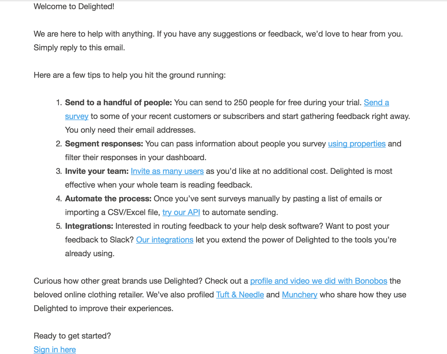
By the time I finish reading this, I’m left with no clue about how I can use Delighted’s product and how it can help me gather customer feedback. Am I supposed to check out their video, or invite my whole team, or try out their API? I’m overloaded with options.
Their first ask is clear. Delighted is there to help me with anything; all I have to do is reply to this email with feedback. But that direction gets buried by a dozen other CTAs.
You don’t want to ask too much of a brand new user, but you should ask something. This is the beginning of your relationship. Your goal is to make them successful. Start by asking what they need and leave off the rest.
Here’s a good example from Segment:
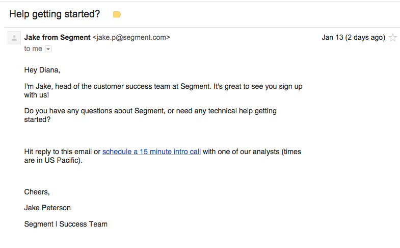
It’s true that not everyone is going to reply to this type of welcome email. For the users you can get on a call, though, you’ll have the chance to identify what brought them to your product in the first place and how they can become successful using it.
Of course, welcome emails are only one aspect of a smooth onboarding flow. If you’re thinking about onboarding as something that doesn’t end right when a customer converts—and you should be—product updates are another important component.
Don’t ignore product updates as part of onboarding
Onboarding doesn’t end with a successful welcome email, and it doesn’t end at conversion or paid user either. Onboarding continues as long as there are new things for users to discover—which is good news if you’re constantly improving your product.
Don’t neglect product updates as part of the onboarding process. As you improve your product, you need to let your customers know what’s so great about it—without spamming people.
A big product update presents an opportunity to create a good onboarding experience for users. You have the chance to engage them further and deeper. Don’t pass it up by bombarding them with incoherent update notifications.
Let your customers know there’s a reason behind each update—you’re making the product better because it affects and improves their experiences with it.
Get this message across by coordinating big launches across channels:
- Post an update to your blog with what you’re working on.
- Share your update to Product Hunt and build a buzz about your product in the SaaS community.
- Share on social media.
Spread the news of features and fixes to get users flocking back to the main event—your product.
Let’s take a look at how Drift did this with the launch of Drift 2.0:
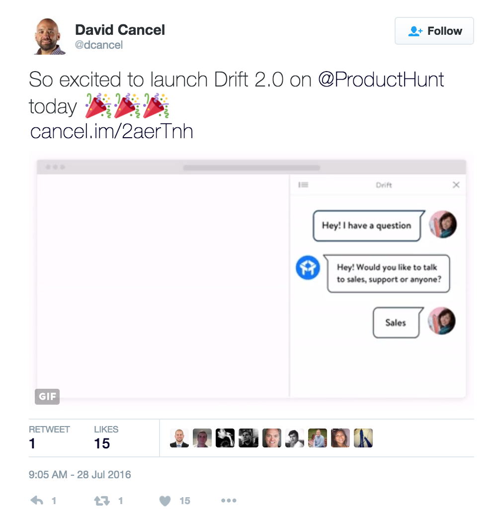
When launching Drift 2.0, the company’s founder and CEO David Cancel posted a short tweet. Instead of trying to explain everything that Drift had done, he simply attached a short video to his message.
Product Hunt
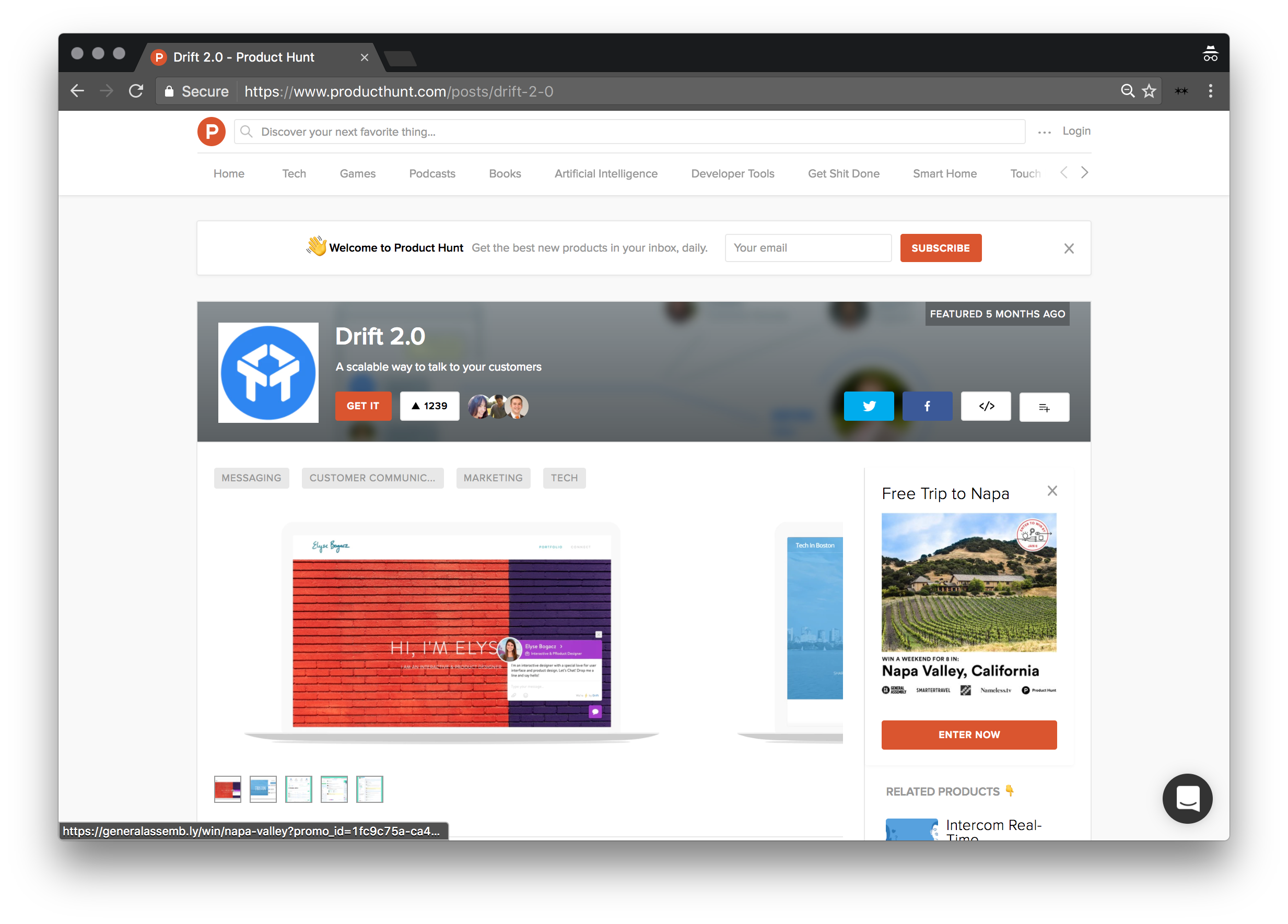
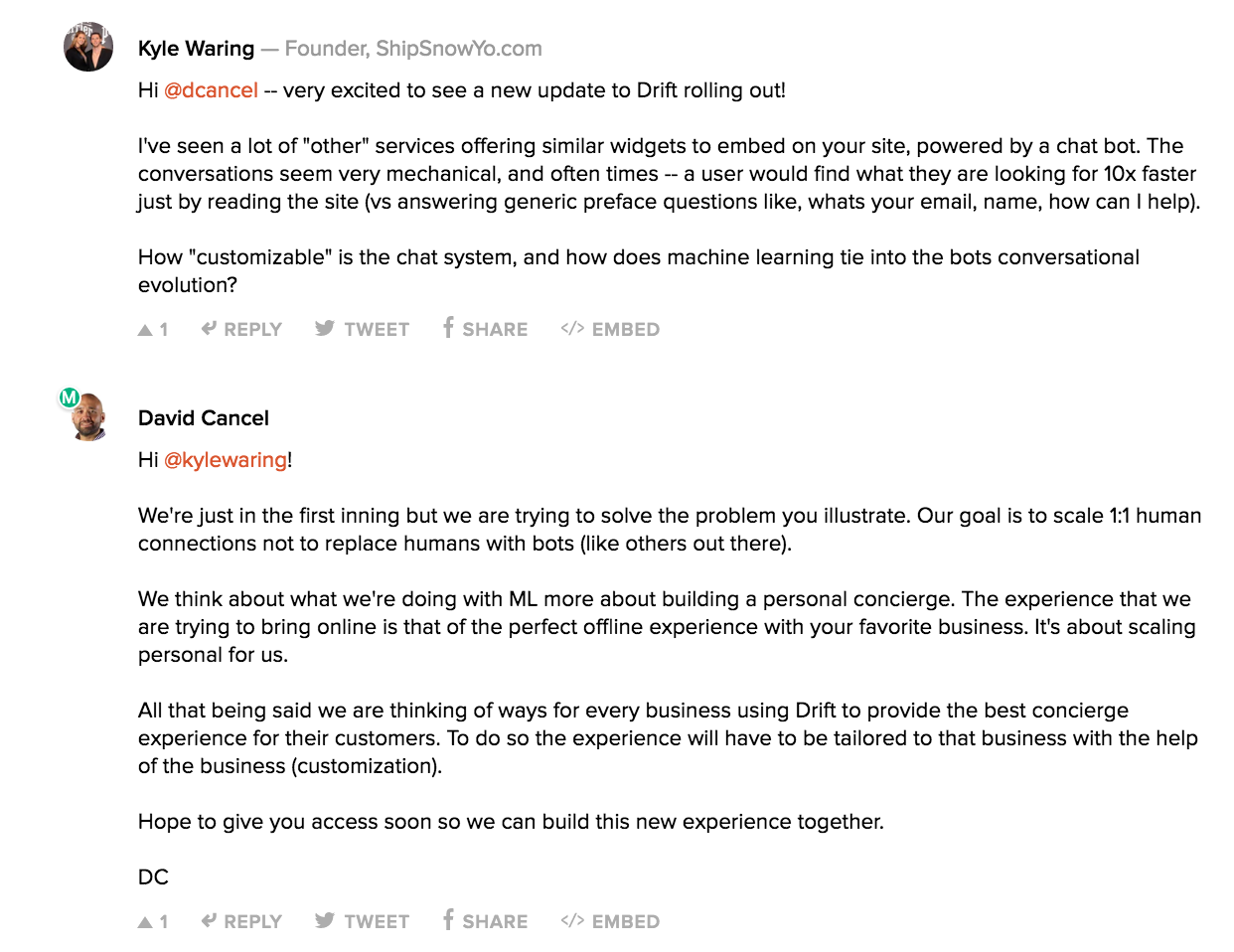
On Drift 2.0’s Product Hunt page, David Cancel asked users to post any questions they might have.
David impressed customers on Product Hunt because he put himself at the forefront of Drift’s customer service. He addressed these questions and answered every one of them. In doing so, he showed how Drift is focused around its customers, both existing customers and potential ones.
Blog Post
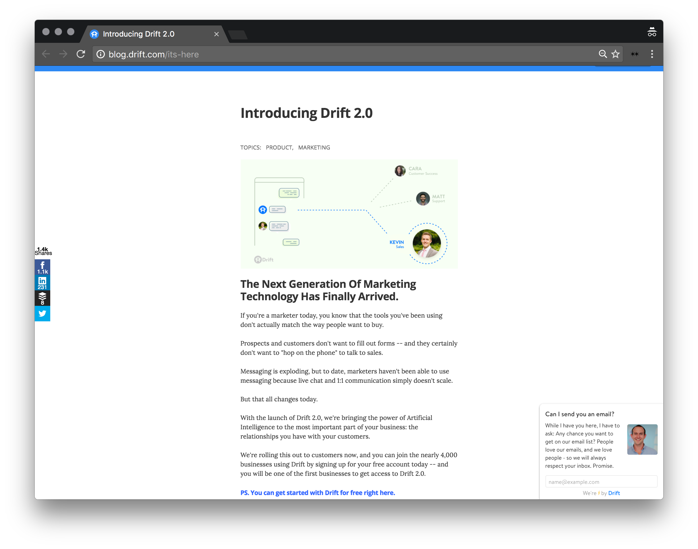
Product Hunt, Twitter, and in-product messages are good for getting your update in front of a new audience. But there’s not always enough space to provide context—Why have you updated your product? What’s in it for the user?
For that, you need a blog post. Your own blog is a space where you can dig deep into the why and how of this update. Show why this new feature is meaningful for the customer. Show how it can be used to make peoples’ lives better.
If you’re looking at user onboarding just as a way you can prevent churn, you’re doing it wrong. An effective welcome email and a well-timed product update are ways to engage users more deeply with your product, and turn them into advocates. You can find even more opportunities for engagement when you segment your users.
Don’t let people slip through the cracks
When it comes to in-app onboarding messages, they need to be specific and helpful—never spammy. You have to start by looking at actual user behavior.
You’ve probably heard about Facebook’s “7 friends in 10 days” metric. Early on, Facebook found that users who hit this milestone were much more likely to stick around. So the growth team at Facebook threw everything they had during onboarding at helping users get there.
Like Facebook, you need to figure out where people are really locking in and engaging with your product, and where people are slipping away. Once you find out which metrics you should be paying attention to (something you can measure, like “7 friends in 10 days”) you can adjust your onboarding flow to nudge users in the right direction.
Segment your users according to what features they actually use. Leverage engagement data from your analytics platform, whether it’s KISSmetrics, Mixpanel, or Amplitude.
Then take a step back:
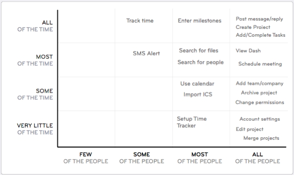
Your analytics may show that when users post a message in your productivity app, they’re more likely to stick around long-term. That’s great, you’ve found that posting a message is a core action of your product.
But what if there’s a big group of users not completing that action?
At this point, you might want to consider in-app messaging as part of the onboarding experience. Target the group of users who need to see your message. Show them what they’re missing.
You can also use tooltips and messaging to relaunch an old feature that users simply haven’t noticed before. The team at Sidekick, HubSpot’s email productivity tool, found that open-tracking was an incredibly sticky feature that kept people using the product.
Unfortunately, a lot of people would turn the feature off when sending an email to a friend, and forget to turn it back on. Sidekick’s growth team did something incredibly simple: they turned the feature back on, and added a little tooltip explaining why.
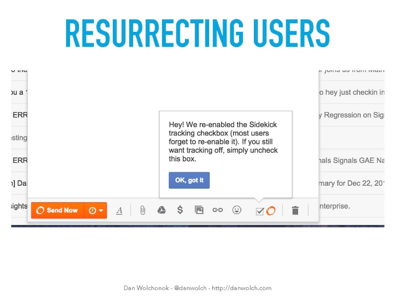
The Sidekick team knew that this message was relevant to the users they were sending it to. The message’s recipients had all previously used Sidekick during their experience of the product and were aware of its benefits. Seeing this message pop up was unlikely to confuse or distract them because they had all the context they needed to understand it.
When you find the features that are really sticky, you know specifically what you need to message users about to make them stay.
It’s your job to provide a service
Onboarding is your best line of defense against churn. You have to do it strategically and resist the urge to send out cluttered welcome emails and a million in-app notifications.
Think about onboarding as a series of opportunities to engage users at a deeper level.
Use your onboarding flow to show users that you’re doing work to make their lives easier. This is software as a service. Serve users by noticing where they hang out in your product and listening to what they need before you even think about interrupting their experience. Ensure that onboarding isn’t a one-and-done sort of thing. Here are some things you can do so users feel connected to your product as soon as they start using it—and for as long as they continue to use it:
- Keep welcome emails personal, simple, and open. It’s not a “thank you for signing up.” It’s also not a “here’s everything you would possibly need to know.” It’s your first big opportunity for customer development. Take it.
- Prioritize value in product updates. Don’t send out a push alert for every bug you fix. That doesn’t tell a user anything about how your product is evolving to make their experience better. Coordinate big product updates over multiple platforms to pull new users in, and remind existing users that you’re continuously improving.
- Use in-app messaging carefully for sticky features. Be intentional in how you target users in-product, honing in on the things that make people stick with you. Remind the right people at the right time about this feature or that update, rather than spamming users about everything.
Onboarding begins with a sign-up, but it doesn’t end with active use, or even paid use. Even the most successful early adopters can fall off if you’re not being strategic and personal in how you launch updates or send messages. If you take every opportunity to learn more about your users and remind them exactly how your product is valuable, they’ll develop a much deeper sense of why and how your product is helping them. Better yet, they’ll stick around.
For more on just product updates, check out this episode of The Startup Chat with Steli and me.
