How to Design a Sticky Product Experience
If you’re working in SaaS, how do you design a sticky product that people keep coming back to? One answer is to follow the consumer application model. You can layer “@ mentions” and notifications into your product that constantly pull your customers back, like consumer apps do.
Stacking more features onto your product may drive short-term engagement, but it also adds more complexity. Using this method is like staring at the problem from the outside and seeing what works for other people, rather than breaking it down and figuring out what works for your app.
Real stickiness means that you don’t have to bug users for their attention. They simply give it to you.
Focus on the Things that People Need
Creating a sticky product is rarely about having the most comprehensive feature set or the most advanced technology.
Take the GRiDPad, one of the earliest versions of the tablet computer. Launched in 1989 by Jeff Hawkins, it was roughly the size of an iPad Pro—if the iPad Pro was five pounds and two inches thick. The GRiDPad was revolutionary technology and a market failure. Most people, it turns out, weren’t willing to trade the convenience of a paper clipboard for the capabilities of a five-pound tablet.

When Hawkins set out to build the Palm Pilot, he cut out a wooden block that would fit into his front shirt pocket. Whenever anyone on the Palm team wanted to add a new feature, Hawkins would pull out the block and ask where it would fit. By the time the Palm Pilot launched it only had four features: contacts, calendar, tasks, and notes. But because it was easy to carry around, it was a huge success.
While physical hardware has material constraints, creating web apps can be a bit trickier. There is no wooden block that limits what you can build. It’s always possible to add more tabs, views, and features. When you’re struggling to drive engagement around your product, it’s very tempting to do just that—add.
But before you do, ask yourself first where the new feature fits.
Let’s look at three examples of products that were bogged down by too many features that people didn’t use. Then, we’ll look at three products that successfully navigated feature bloat. Finally, we’ll get into how you can find your product’s stickiest features and drive engagement toward them.
Products Bogged Down by Too Many Features
1. Wesabe: Make things easier for your customers
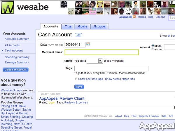
Wesabe’s Web app
Wesabe was a personal finance management website that launched in 2006 and shut down in 2010 due to the rise of its main competitor, Mint.
In a company post-mortem, Wesabe co-founder Marc Hedlund wrote that where “Mint focused on making the user do no work at all, by automatically editing and categorizing their data,” Wesabe pushed to make its product as precise as possible to “help people change their financial behavior for the better.”
To attach your financial information to Wesabe, you had to install the Wesabe Uploader to your computer. Mint used a service called Yodlee that allowed you to automatically import bank account data into Mint.
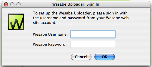
Early Wesabe users had to use a client to manually upload their bank account statements.
Wesabe focused on building features that would make it easy for people to edit and sort their financial data. Mint made it so that users wouldn’t have to edit their data at all by automatically sorting this data. Hedlund points out that early on, Mint didn’t do this very accurately—but it didn’t matter.
Using Mint was easier than using Wesabe, so people used Mint. Most people didn’t care that Wesabe was more accurate or more secure.
2. Google Wave: Don’t create new user behavior
-
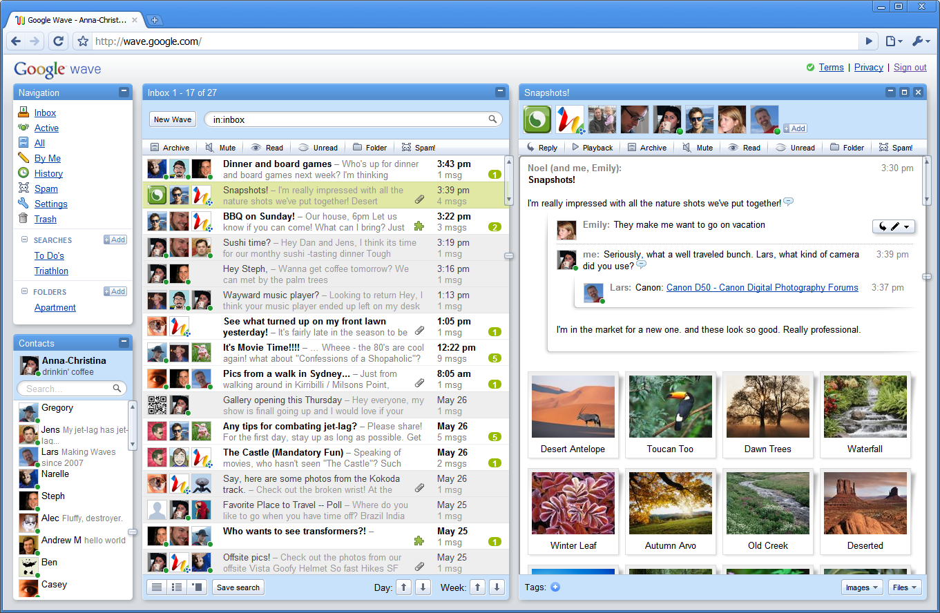
Google Wave launched with a messy, confusing interface.
In 2009, Google launched a new product called Wave, which it billed as “what e-mail would have looked like if it were invented today.” Google Wave included features for e-mail, instant messaging, wiki-style group collaboration features, real-time chat, and the ability to publish “waves” to the web. The basic idea behind Wave was that all communication should follow the same form, from chat, to e-mail, to document editing.
The problem was that in setting out to re-invent e-mail, Google was trying to re-invent the way people communicate online. Instead of building on top of existing behaviors, Wave was trying to force users into a completely new and unfamiliar workflow. For anyone already used to collaborating on Gmail, Google Chat, and Google Docs, using a “better” email system wasn’t as important as actually getting stuff done.
3. ICQ: Design for your average user
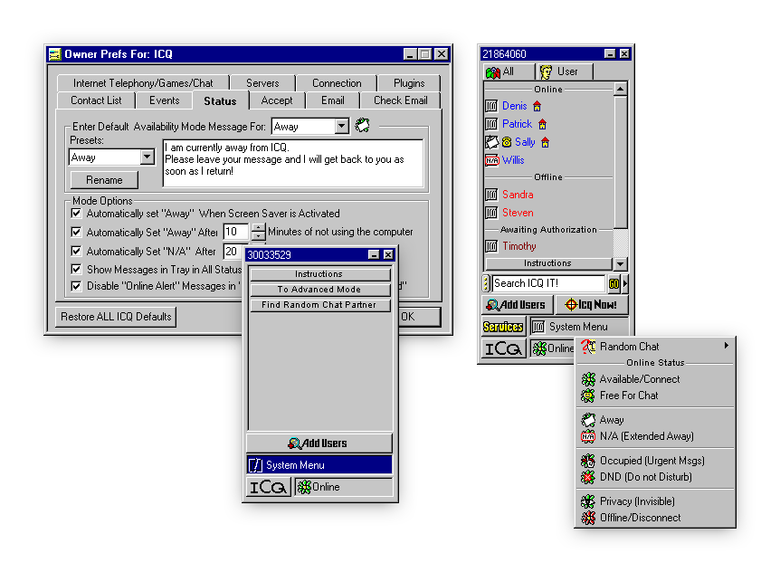 Before AIM, there was ICQ. Launched in 1997, ICQ was the first instant messaging product online. Compared to AIM, you could do a lot more with ICQ. ICQ included offline messaging, multi-user chats, daily-limited SMS, resumable file transfers, greeting cards, and multiplayer games. The addition of features ultimately slowed down ICQ’s product and made it harder to navigate.
Writing on ICQ, Dropbox co-founder Drew Houston points out that “ICQ became so comically bloated that they released an ‘ICQ Lite’ version but by then they were already on the decline.” While ICQ may have been the better option for tech users who cared about customizability and specific features, AIM was more than enough for the average user with a dial-up modem. ICQ ultimately stagnated, and was acquired by AOL.
Layering on extra features typically only makes your product harder to use. Let’s look at three examples of products that were able to maintain focus over time.
Products That Mastered Feature Bloat
1. Gmail: Focus on 3 key features
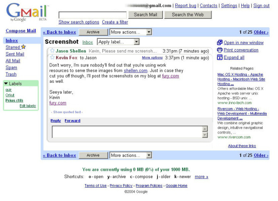
Gmail in 2004. (Image Source: Time)
The first version of Gmail was hacked together by Paul Buchheit in a single day. Buchheit was an engineer who had previously worked on Google Groups. He used some existing code to create a search engine for his personal email inbox. When he showed it off to his fellow engineers, they wanted it too, and that was the beginning of Gmail.
As Google developed the product further, they focused on creating a clean interface for email. Other email services would refresh an entire web page every time you clicked a button, forcing you to wait a couple of seconds. Google engineered Gmail to be a full-blown web app that used javascript to make everything load really quickly. You could scan through threaded conversations and reply without losing context.
Paul Bucheit’s advice remains invaluable to anyone building a product today: “Pick three key attributes or features, get those very, very right and forget about everything else.” By focusing on search, an easy-to-use interface, and a whopping gigabyte of free email storage, Gmail blew past anything else available at the time.
2. Basecamp: Saying no to feature requests
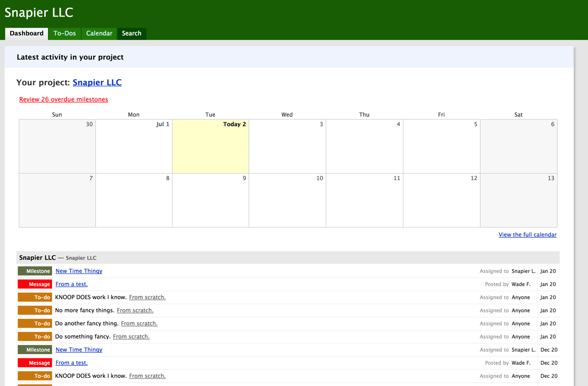
Basecamp Classic
When you have users clamoring for a specific feature, your first instinct should be to ask why. The team at Basecamp found themselves in this exact situation. In 2005, Basecamp had just launched and was beginning to grow its user base.
At the time, Gantt charts were a popular way of visualizing project management, and they weren’t a feature in Basecamp. Customers complained. One even wrote an angry blog post about it, explaining that Basecamp would be the perfect product if only it had Gantt charts. Jason Fried, co-founder and CEO of Basecamp, responded in the comments: “We all have ideologies. Yours includes an absolute necessity for Gantt charts. Ours doesn’t. We just have different opinions of what is required for good project management.”
Basecamp’s core philosophy was that a lack of communication made collaborating hard—not a lack of pretty charts or statistics. And they stuck to it. Even though Basecamp has grown as a business, it has reduced its offerings at the same time, retiring products like Ta-da List, Writeboard, and Backpack. This relentless philosophy of focus has been a big part of Basecamp’s success over the past 17 years.
3. HubSpot: “Just Ship it”
When David Cancel took over the product team at HubSpot in 2011, he found himself leading a 50-person team of engineers, designers, and product managers. When you grow the size of your product team, you typically add more steps to product development. At HubSpot, David did the exact opposite. In doing so he helped cut HubSpot’s churn in half and doubled their LTV:CAC ratio.
David didn’t hire project managers or add more process to manage a larger team. Instead, he scrapped HubSpot’s product roadmap. In its place, he rolled out shared metrics for the entire product team to focus on customer happiness, engagement, and retention. Instead of doing two or three big releases each month, they made thousands of smaller ones. David got the product team shipping 500 to 600 times each day.
Because each team was focused on customer-facing metrics, they could double-down on new launches that drove engagement and retention—and quickly table launches that didn’t.
How to Find Sticky Features
So, how do you actually put it all together and find the features that will drive engagement for your app? The first step is to dig into your data. Figure out what features get the most usage from all your customers, which features your paying customers use the most, and which features nobody uses.
The following chart shows the typical feature usage for a SaaS app:
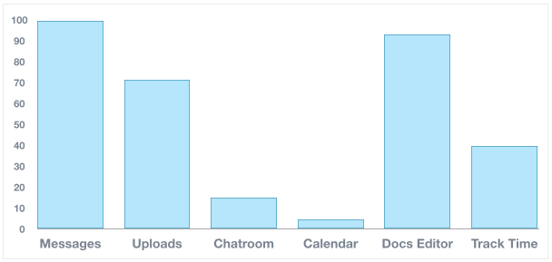
Intercom’s chart of typical feature usage.
The reality is that some of your features will see a lot of use, while other parts of your app will remain untouched. Finding out who uses what part of your product and why allows you to dig deeper into which features correspond to long-term retention and product stickiness.
Say that you have an application that lets people to play music, like Spotify. You find out that a feature that allows users to share music with other users drives the highest engagement. You can use a data analytics platform like Amplitude to help you dig deeper and find out what kind of content sharing drives the highest engagement:
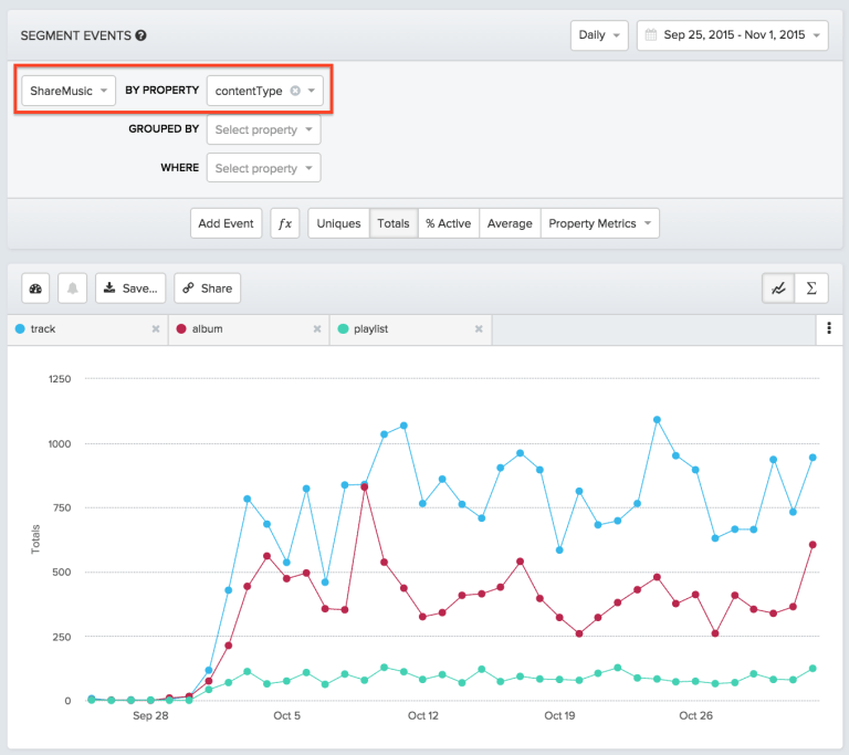
Since not all of your users are created equal, you have to further segment usage by plan type:
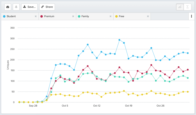
The chart above shows that users on the “student” and “premium” plans share music most often. Because these users are the ones that are actually paying for your service, it’s a good sign that you should double down on this feature.
From there, you can map out user flows to see what drives people to share music the most:
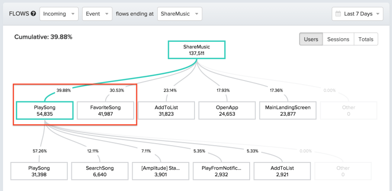
Looking at the above chart, you can see that playing a song and favoriting a song are the two in-app actions that lead people to share more music. That gives you a better window into how you can get even more of your user base to share music.
In SaaS, your stickiest features won’t necessarily be the ones that are used the most often, like creating a document for Google Docs or sending an email. They’re the ones that get users to come back to your app again and again. Once you know what they are, you can focus on driving more usage towards those features, whether that’s through a better onboarding flow, a better discovery experience, or updates to your core product.
Reduce Complexity
Today, Facebook claims over 1 billion users logging in every day and 30% of total time Americans spend on the mobile internet. Consumer applications like Facebook have high product stickiness, and the temptation for SaaS applications is to follow.
Maybe you open up your product to teams, thinking that more social interaction will lead to higher engagement—and the opportunity to charge per seat. Pretty soon, you’ve introduced threading, chat, and status messages. These features might drive higher engagement and a revenue boost in the short term, but they won’t be enough to retain users over time.
Blindly introducing features into your product is a short-term strategy that will bloat your product and eventually make it unusable. To create a truly sticky product, you can’t simply imitate what other products do. You have to dive into your own usage and metrics to find what’s already working.
